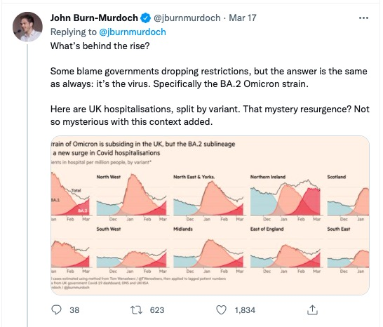
And then answers it with infection data split by variant (using a line chart clearly demarcated by variant):
Note that he could have given this split in the earlier chart itself… but he uses the following principles in the second tweet:
– Start with the Big picture (only) first; give the details later
– Control the release of information
– Pique audience curiosity by explicitly stating the question before answering it
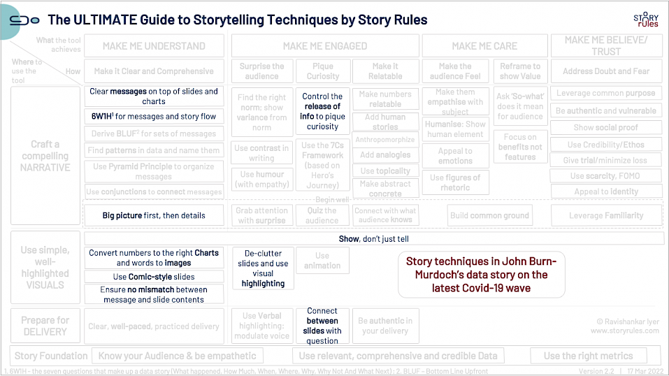
Further, throughout the thread, John uses the 6W1H framework (the seven questions of a data story – What happened, How much, When, Where, Why, Why not and What next):
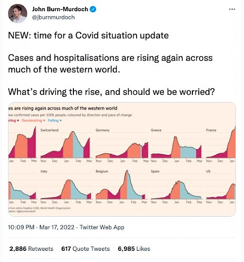
– What happened: Covid cases spiking again
– How much: Quite severe in some countries, not so much (yet) in others
– When: First half of March-22
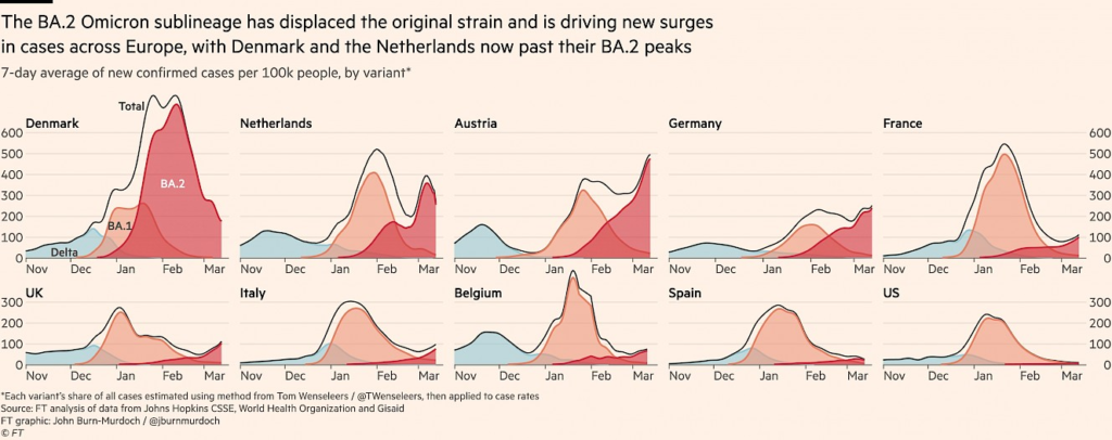
– Where: This is where the thread spends most of its time. There are significant spikes seen in Austria, Switzerland, Germany; increasing trend also seen in Greece, France, UK, Italy, Belgium; no visible spike yet in US, Spain; and countries like Denmark and Netherlands are already descending from their peaks
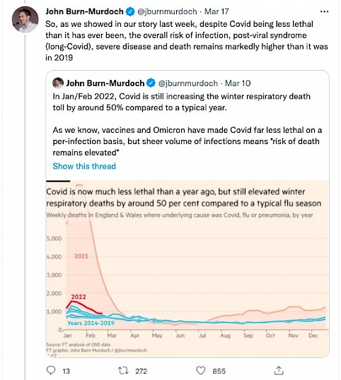
– Why not (what factors are ensuring the cases and hospitalisations are not much worse than they are): Since most of the population is vaccinated, it’s surmised that BA.2 won’t be as lethal as previous variants.- Why: The Omicron BA.2 Variant (“BA.2’s transmissibility advantage over BA.1 is driving the resurgence”)
– What next: A very nuanced position taken on this. For instance, take this tweet:
Essentially, the net takeaway is: While the new Covid variant is far less lethal than the original variants, it is more dangerous than the typical common cold. So exercise caution.
Finally, every chart in the thread follows several key data-storytelling principles:
It has a clear message on top
Makes extensive use of the simple line graph to make its points.
Uses simple annotation to make readability clearer (no inconveniently placed legends)
The key message is visually highlighted and unimportant elements pushed to the background using the colour grey