#SOTD 82: A striking visual to compare population density

#SOTD 82: A striking visual to compare population density
In many countries, population density varies widely between regions – but the US has some of the starkest differences in this aspect.
How do you show that difference vividly?
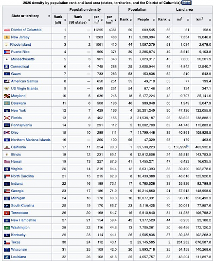
You could just put a table like this:
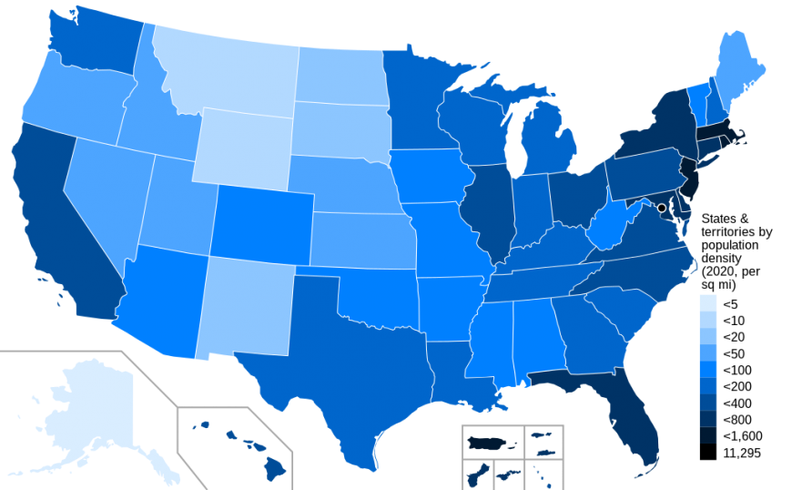
Or you could use a map:
But is there a way to show it such that it is visceral? That gets you to appreciate how sparsely populated some US states are?
There is – as shown by Ben Blatt in these maps (highlighted in a tweet by Tim Urban)
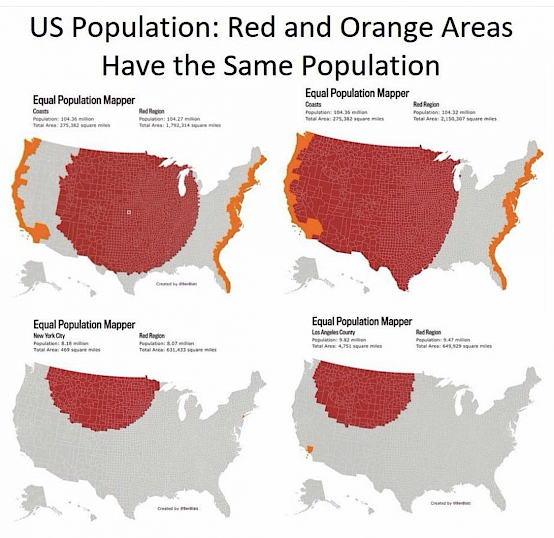
Look at the bottom two maps for example. The population in all of the red areas can fit in a New York or LA.
It is a fascinating use of visuals and making numbers relatable to give you a sense of how densely populated some US regions are (and how sparsely populated some other regions are).
#SOTD 81