
10 guidelines to make impactful PowerPoint presentations

The phrase ‘Death by PowerPoint’ returns an inordinate 75M hits on Google. The reason? Many users just consider PowerPoint as ‘MS Word plus Headers and Bullets’ and end up creating dense, soul-draining slides.
Perhaps that’s why Amazon did away with the use of PowerPoint presentations in its meetings…
That’s a pity, because, if used well, PowerPoint is a great tool to tell a compelling, visual story. And you don’t need designer-level skills for that – these 10 guidelines are a great way to super-charge your presentation.
I have divided these ideas into 3 sections: Narrative, Visuals and Delivery
– Narrative: Your story in words and messages – what is it that you are trying to say?
– Visuals: Graphs, pictures, icons (and tables, text) that illustrate your narrative messages
– Delivery: Your verbal delivery of the presentation (either face-to-face or remote)
A. Narrative guidelines
1. Start with Pen+paper and Word: Don’t start off your presentation on PowerPoint. You read that right. Before even opening the application, you need to firm up your presentation narrative on paper.
What is your ‘narrative’? It consists of messages (insightful and surprising findings), that are strung together to form a written story.
Here’s an example of a Narrative for a presentation.
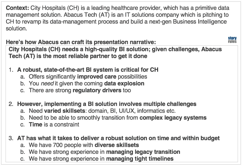
The best framework to build your narrative is the ‘Pyramid Principle’ (illustrated in the above example). I have blogged about how leaders like Jeff Bezos and Warren Buffet have used it.
There are three advantages of crafting your narrative on Word before starting work on PowerPoint:
– You can review just the narrative with your boss/peers, test it for completeness and flow and get clarity on what is your overall story
– With a robust narrative, the job of slide-making becomes much faster and simpler
– You also avoid rework and extra work (making unnecessary slides for instance)
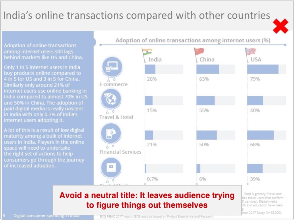
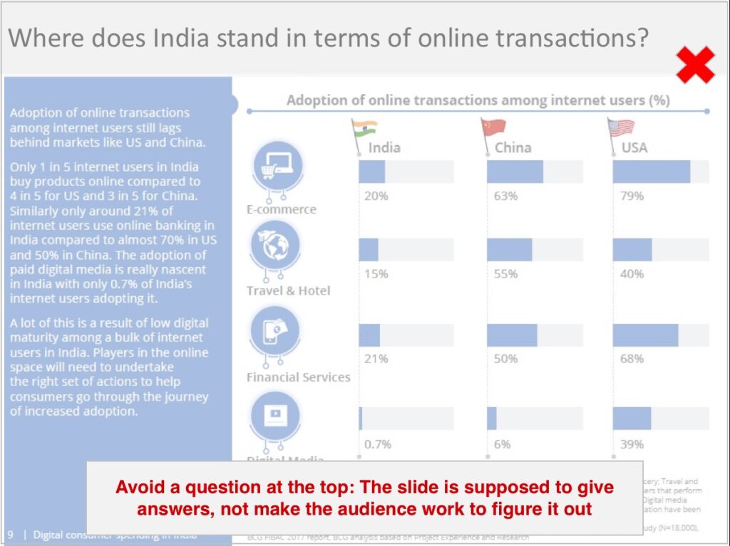
2. Use the headline space for your message: Once the narrative is done, you start work on individual slides. The most critical portion on a slide is the top-left header. Many slides leave it as a title or neutral header. Instead, you need to craft a clear message that distils the slide’s meaning into one line. The main principle to use here is norm-variance, as written about earlier. A good message does one of three things vis-à-vis the information on the slide
a. Provides a one-line summary (or synthesis) of the slide’s contents
b. Prioritises one or two key findings among several on the slide
c. Calls out the implication/recommendation arising from the slide
The examples below show how a message adds value to a slide.
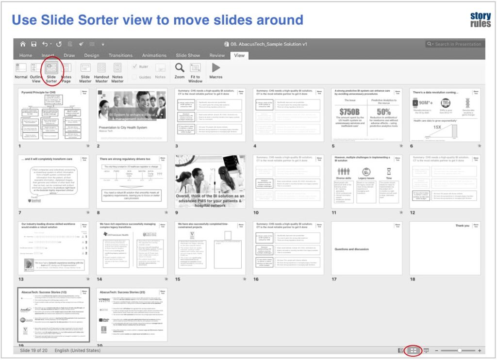
3. Use Outline & Slide sorter views to ‘review’ the narrative: An underused feature of PowerPoint is the Outline view (View>Outline view). The feature is especially useful if you receive a presentation for review – you can use this view to quickly check the narrative flow. If you feel the there is no flow, or it is completely broken, then don’t bother modifying the slides – revise the narrative first.
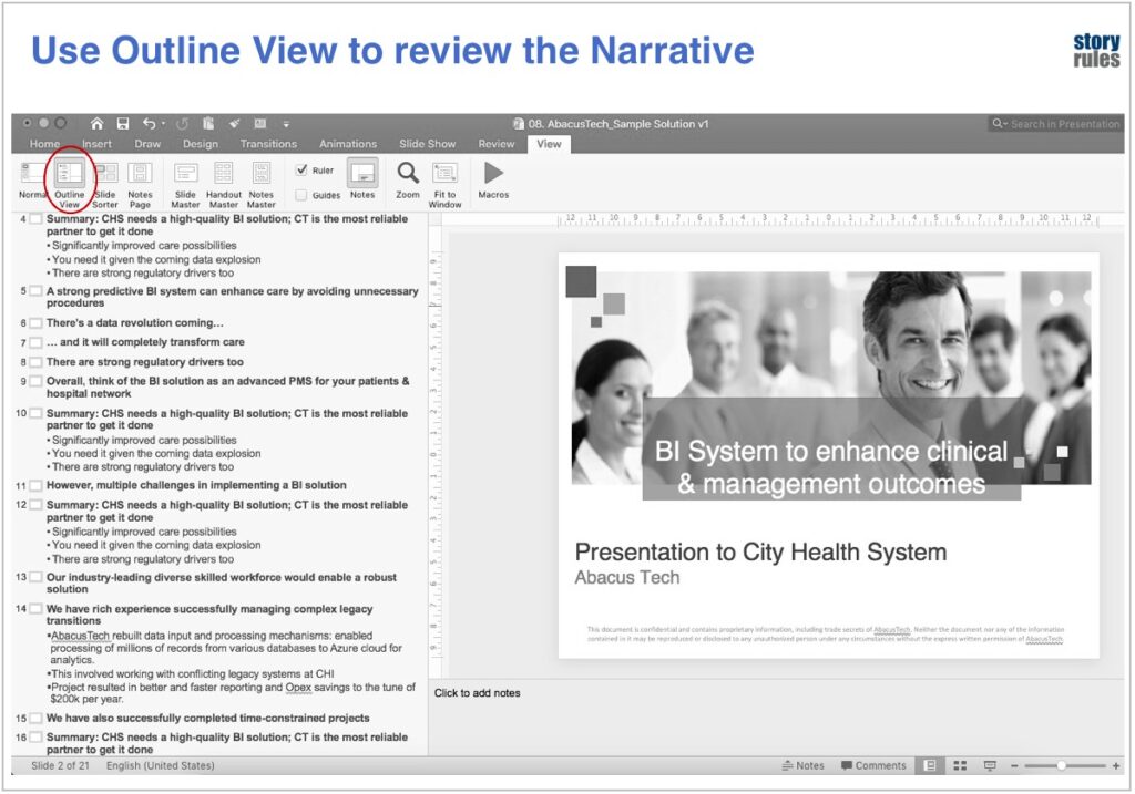
Another useful view is the ‘Slide Sorter’ view (View>Slide Sorter) – I use it to get a birds-eye overview of the slides and move them around to get a better flow.
4. Use story tools to make complex concepts relatable: If your presentation has slightly complex, technical stuff that your audience may struggle to understand, you need to use story tools such as ‘human stories’ and ‘analogies’ to make it relatable. This earlier blog post would give you a quick primer.
B. Visual guidelines
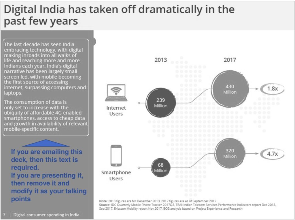
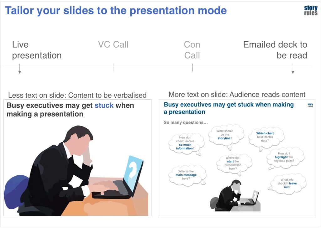
5. Know which mode to use – Presentation or Slide-doc: A key question to answer is – Would you be actually presenting your deck to the audience (face-to-face/virtually), or would you be just emailing it to them? If the latter, then your slides need to be self-sufficient, i.e. like a document. Most consulting presentations come under this category. Here’s a sample slide.
But when you are actually presenting your deck, then, apart from the slides, there’s a crucial extra ingredient – your voice! In this situation, if whatever you are saying is also present on the slide, then you end up completely overwhelming the audience: Should they read the slides? Listen to you? Look at you?
And so, most often there’s a mismatch between what you are talking about and what the audience is reading. And then they get onto their phones. It’s a mess.
Which is why you need to have a different type of slide in case you are presenting it – visual, simple and with minimal text. Here’s an example of the same slide under both modes:
These two related articles – one by Carmine Gallo on Apple’s visually simple slides and another profiling a TED Talks presentation coach – emphasise the same idea: limit your content to one idea per slide, and represent that idea with an evocative visual and with the absolute minimum text. A useful analogy: Think of your slide as a hoarding. In 5 seconds the audience should be able to read the content and then focus their attention on where it matters: you.
Of course, this means that, when you present a slide, you will need to prep and know your material well. But this preparation ensures your audience finds it significantly easier to understand.
6. Make your slide comic-book style!
Would it be fun reading a comic strip like this?
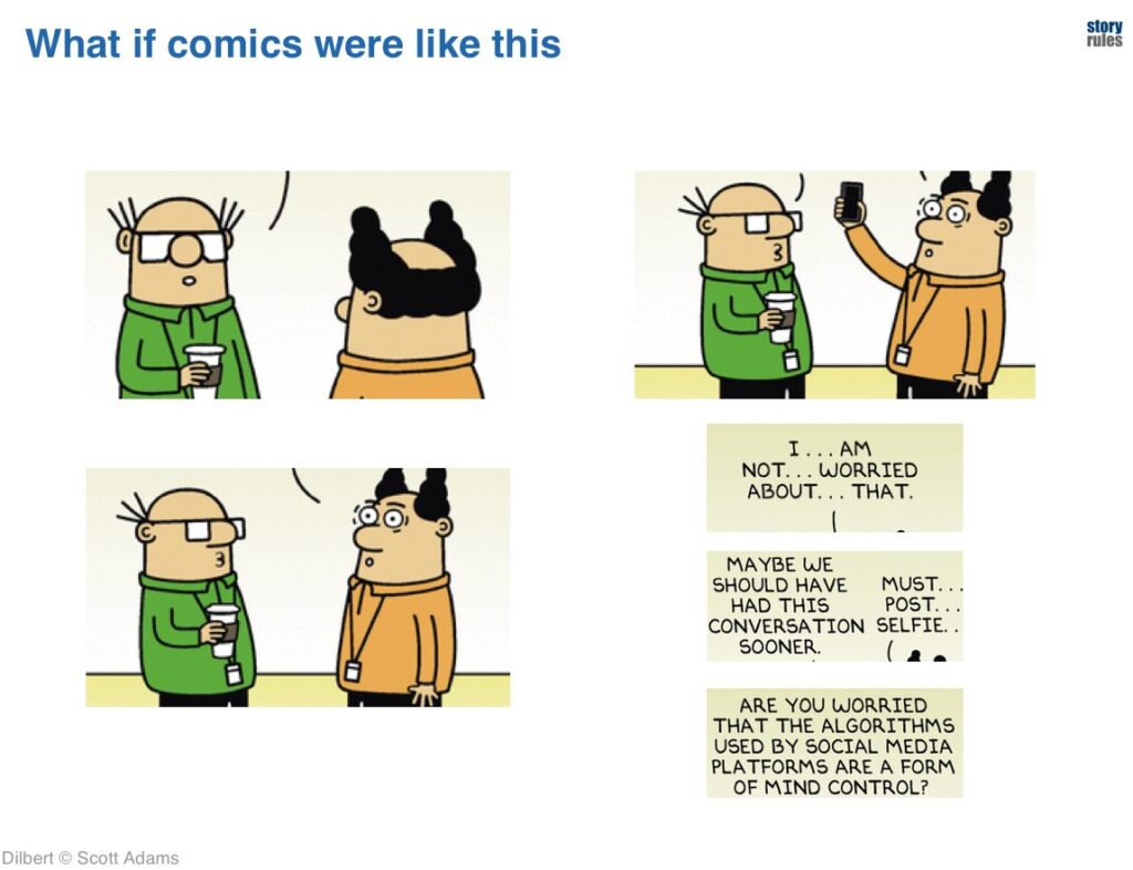
Not really? But isn’t the material all there…? I’ve just mixed them up! You say, ‘But, we need to figure out which message fits with which visual, and what is their order … That’s a pain’
I agree. But then, why do we create slides like these?
In such slides, you are making the audience play ‘Match the following’. The poor guys are trying to figure out which message goes with which visual.
Comic books get it right.
We need to replicate this style on our slides. Here’s how it can look:
To do this, you’ll need to ignore a lot of non-critical messages and focus only on the most important ones… and then make them flow like a story, as above. Not easy, but rewarding for the audience.
7. Use pictures and icons: There’s an old saying in storytelling: Show, don’t tell. Our brains are wired to comprehend visual information much faster than text. So, in your presentations, when you are tempted to use words to explain something, ask yourself: Can I use a picture or icon to explain or add-value to what I am saying? Icons especially are great, since they are vector images – which means you can change their colour to keep it consistent with your overall slide’s colour palette. I will do a separate post on the use of images and icons on slides, but for now, just keep this simple principle in mind: Show, don’t tell. Here’s a sample slide.
C. Delivery guidelines
8. Prepare a script for each slide: When presenting a slide, we normally tend to say the first thoughts that come to our mind when we look at it. It’s almost as if we are grappling with “oh man, now that this slide is here, let me figure out what to say”.
The moment you are unsure about what to say on a particular slide and hesitate (or worse, try to over-talk your way through it) you risk losing the audience’s attention. The best remedy: prepare a script for every slide. For the script you’ll need to consider 3 things:
- What to say
- What not to say
- In what order to say
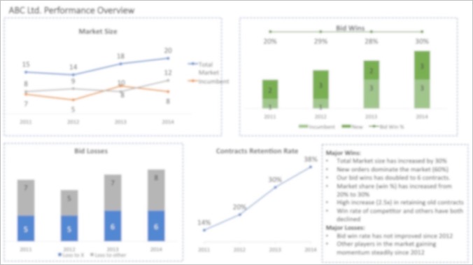
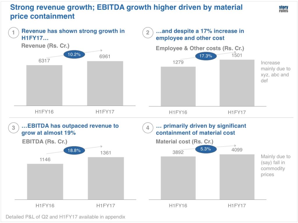
9. Ensure smooth transitions between slides: A presentation is a conversation that has breaks in between – the gap between two slides. In this gap, if the flow isn’t strong, you risk losing the audience. Observe the 3 slides shown below. Does it seem like it has a clear flow?
It doesn’t right? Which is why you need to ‘prepare’ the audience for the upcoming slide. This is best done by ‘planting’ a question in their head, as to what the next slide will be covering. For e.g. here’s how I would transition between these three slides:
This simple act – of asking a question before moving on to the next slide – leverages the audience’s innate curiosity and prepares them to absorb the information on the next slide.
10. Know when to keep the slides off: A presentation is just a visual aid – the real objective is to have a meaningful discussion that leads to better decisions. If you find the audience engrossed in discussion with you or each other, feel free to switch off the presentation screen. There’s a simple hack to do that – when in full-screen mode on any presentation, just press the ‘B’ key. Go ahead, try it. The screen turns black. Want to bring the slide back? Just press B again – it is a toggle key. In my training sessions, I’m pleasantly surprised by how many folks don’t know about this (and they invariably find it very useful)!
Another cool under-used trick is the ‘Hide Slide’ feature (right click on the slide and select ‘Hide slide’). These hidden slides won’t appear during the slide show. It’s useful when you want to ignore some slides while presenting (without deleting them or pushing them to backup).
———-
There you have it – 10 simple but powerful tips to super-charge your next set of presentations!
Give it a ride and let me know how it goes. Happy to provide inputs if you need them.
Photo by Teemu Paananen on Unsplash
Related Posts
40 Stories at 40: The e-Book

3 ideas to tell better data stories in the ChatGPT era

Supercharge your data story with messages that are: clear, surprising, relatable and valuable

E19: Toshan Tamhane – Lessons from Mckinsey, Meetings and Marathons!

E18: Paul Smith – Bestselling author of books on storytelling