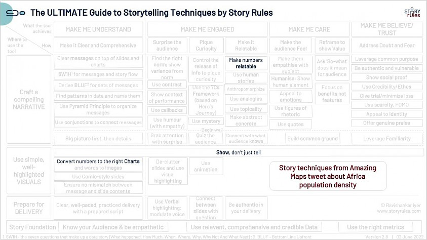
#SOTD 98: A simple visual to compare populations (Amazing Maps)

#SOTD 98: A simple visual to compare populations (Amazing Maps)
Consider this Wikipedia table about population by country in Africa.
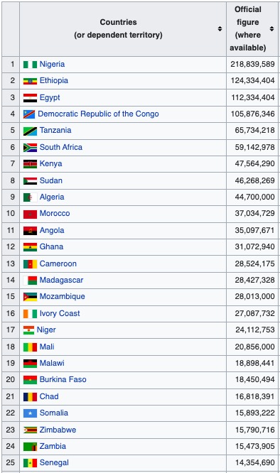
Notice something unusual?
If you look at the table closely, you will see the following trends:
1. Nigeria is the most populous country by far
2. South Africa is surprisingly smaller in comparison
3. If you exclude some regions – especially Egypt and East Africa (Ethiopia, Tanzania, Kenya etc.) – the other countries are not very heavily populated, despite many of them being in the tropical zone.
Keeping these in mind, a Twitter handle called Amazing Maps created a very cool visual to show how Africa’s population density varies significantly across the continent (the red area roughly corresponds to Nigeria).
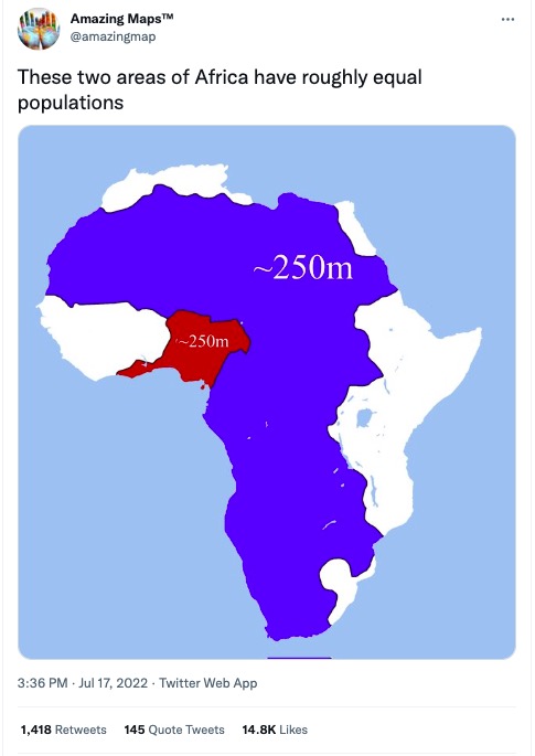
Such a simple yet powerful visual to make the point!
If you are wondering as to the reason for this disparity, the answer is two features: the Sahara desert and rainforests!
Incidentally, the same handle had also created a striking visual showing the incredible density of the Indo-Gangetic plain (which I call as the most populous piece of real estate on earth).

Be creative in your use of visuals to make your point – and make your numbers relatable.
#SOTD 98