#SOTD 49: Clear messages on top of charts

#SOTD 49: Clear messages on top of charts
April 21, 2022
Normally when we create charts, we just put a title on top like this one by the US CDC:

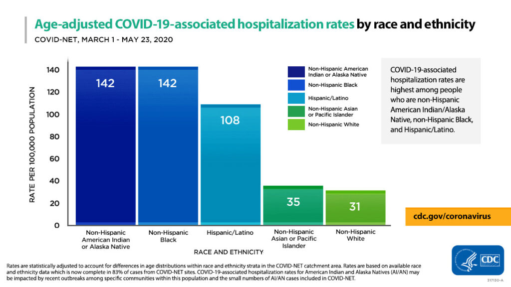
Instead, it could have a message on top of the title. Something like: ‘Covid Hospitalisation rates almost 4-5X for African Americans and Hispanic Americans as compared to White Americans’The issue with this chart is that it makes you actually pore through the chart (with the legend, colours etc) to understand what it wants to say.
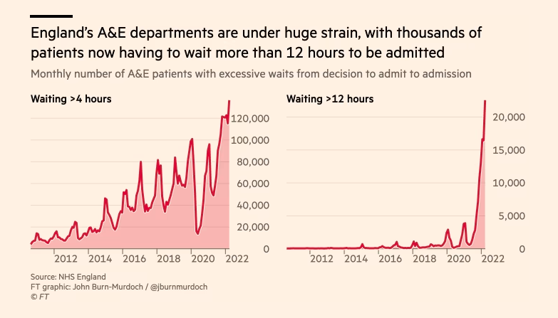
Here is an example of a recent chart with a clear message on top tweeted by Oliver Barnes of the Financial Times:

Also note:Having that clear message above makes it easier and faster for the reader to understand.
- The right choice of chart (line)
- Clear titles and legend
- Light gridlines that fade to the background
#SOTD 49

Related Posts
Why Big Tech went pro-Republican in the US
February 3, 2025
6 views
The Healing Power of Stories
January 27, 2025
11 views
Storytelling in Economics with Tim Harford
January 20, 2025
8 views
The Impact of Family Stories
January 13, 2025
3 views
Science Storytelling Tips from Mark Rober
January 6, 2025
11 views
Do Leaders Need to be Feared or Loved?
December 28, 2024
11 views