
Sunset time for Covid-19?

This week’s headline article makes for happy reading – and I fervently hope that its predictions come true.
Articles of the week
a. Coronavirus: Game Over by Tomas Peuyo
On the 4th of March, 2020, I was taking a training program in Bangalore. I remember the news bulletins reporting a steady rise in cases of the mysterious new coronavirus in India. I was wondering – is this the real deal? Should I be worried?
That question was answered in a superb post by Tomas Pueyo (one that received 40M+ views), ‘Coronavirus: Why you must Act now‘.
I remember the blunt way in which Tomas laid the bottom-line-up-front (or BLUF – a storytelling technique that I teach) at the beginning of his piece:
When you’re done reading the article, this is what you’ll take away:
– The coronavirus is coming to you.
– It’s coming at an exponential speed: gradually, and then suddenly.
– It’s a matter of days. Maybe a week or two.
– When it does, your healthcare system will be overwhelmed.
– Your fellow citizens will be treated in the hallways.
– Exhausted healthcare workers will break down. Some will die.
– They will have to decide which patient gets the oxygen and which one dies.
– The only way to prevent this is social distancing today. Not tomorrow. Today.
– That means keeping as many people home as possible, starting now.
– As a politician, community leader or business leader, you have the power and the responsibility to prevent this.
That was stunningly prescient for something published on 10th March, 2020.
And now, that same Tomas Peuyo gives me great solace when he announces the end of this once-in-a-generation pandemic in his latest piece published on 17-Jan-22.
Here’s how he starts the piece:
Summary:
– Between Omicron, vaccines, and treatments, the risk of COVID is down by 10x to 1000x.
– This Omicron wave is likely to be the last we should be cautious around. As a result, we should officially end the pandemic soon, probably in a month or so, unless some new, pretty unlikely new information appears.
– The biggest risk is that you don’t internalize this and keep as usual instead of realizing we’ve entered the end state of COVID. The next few months will be like the next few years. Act accordingly.
– This is especially true for governments. They need to know when to stop
Tomas uses an interesting war metaphor to signify the ‘last stand’ of Covid:
This is the final battle for COVID. It’s throwing everything it has at us and will overwhelm the world. But in doing so, it might have weakened itself. And it’s attacking at a moment when the world is well-armed with vaccines and prior infections.
One reason for the optimism seems to be that despite (or because of?) being so virulent, Omicron is not as deadly as Delta or Alpha:
And its virulence has been properly estimated now1, at approximately:
– Hospitalizations: 50% lesser compared to Delta.
– Death: 90% lesser compared to Delta, or ~75% less than the original variant, making Omicron just about 2x as virulent as a normal flu2.
Sure, there are still uncertainties. Will there be newer variants? Will new data emerge showing higher hospitalisation and death rate? Will the unvaxxed population throw a spanner in the works? Hopefully no major negative surprises in store…
Another factor to keep in mind while reading this piece (which is Europe and US centric): India is behind the curve as compared to the US and Europe – so we need to exercise caution for some more time and let the virus run its (hopefully) final course.
But I sure hope this is the beginning of the end of the pandemic.
b. ‘Hips don’t lie but Charts do’ by Anup Maheshwari & Swanand Kelkar & Dhruv Maniyar
One of the well-known books on data visualisation is ‘Information is Beautiful‘ by David McCandless.
Sure, if data is visualised well, it can be beautiful. But it may not hold exclusive rights to that attribute.
In his best-selling ‘How to make the world add-up: Ten ways to think differently of numbers‘ British economist and journalist, Tim Harford states: Misinformation can be beautiful too.
Just because information is portrayed using a beautiful chart, it doesn’t mean it’s right. And often, charts can be deliberately constructed to mislead.
In this article, Anup, Swanand and Dhruv (leaders at IIFL AMC) show several examples of how charts can be misleading. Often we make these mistakes inadvertently. But sometimes they may also be deliberate.
This piece gives you a quick reckoner of the key charting errors to avoid and to spot, as an alert reader.
Podcast episode/s of the week
a. Narrative decentralization and the future of progress – with Jason Crawford
Jason Crawford is a leading thinker on innovation and progress and makes some fascinating points about progress.
How we entered the Attention Economy:
Prior to the internet, we had — the way to get the written word out was still essentially through the printing press, right. Through books and newspapers printed in ink on paper. That’s an expensive proposition, and requires a deep capital investment in the printing presses and the distribution networks and so forth. And so when you have a lot of investment into getting the written word out, you need editorial gatekeepers, who are going to make wise decisions about what to do with that limited resource, right, with that expensive resource, how to invest that. And so you have editors acting as gatekeepers deciding what gets published, and who’s good enough to publish and what writing is good enough to publish and so forth.
And then the internet comes along, and essentially takes cost of publishing to zero, certainly the marginal cost, and makes the infrastructure available to just about everybody. Well, now all of a sudden, no editor has to decide what gets published because everything can get published.
But as soon as you do that, you’re now in a — you have a new scarce resource. It’s not paper and ink. It’s people’s attention. There quickly becomes too much stuff on the internet for anyone to pay attention to.
Jason also gently refutes the belief that we are in the most innovative of times in human history:
I think if you look at the pace of progress over the last couple 100 years, the pace of technological progress at the frontier of new technologies being developed and deployed, has slowed down somewhat in the last 50 years or so. Certainly, it hasn’t gone to zero progress. We’ve had a lot of progress in the last 50 years, more so than at any time before the Industrial Revolution. But not as much in my opinion, as we saw around the late 19th and early 20th century.
In the last 50 years, we’ve really mostly seen progress in a single area, which is mostly around information technology, computers, and the internet. And we’ve seen relatively less progress in areas like transportation, manufacturing, construction, or energy.
Whereas if you look at that period, around the late 19th to early 20th century, we were really seeing rapid progress in pretty much all of those areas simultaneously. We had a breakthrough in communications technology with the telephone and the radio, that rivals, in my opinion, computers and the internet. And then on top of that we had the entire electrical industry, the internal combustion engine, the automobile, the airplane, the first synthetic fertilizers, the first plastics, the first vaccines, in about 100 years, etc. So, there was really kind of progress going on across the board.
On the flip side: While his responses were thought-provoking, I didn’t find the hosts adding much value to the conversation.
b. ‘Why Politicians say Dumb Things’ by Jason Feifer – Build for Tomorrow
Jason is one of my favourite narrative podcasters who releases one thought-provoking story a month.
In this episode, he takes up a topic about which we all believe we “know” the story – the case of politicians making mistakes on camera.
For instance:
Remember when Senator Orrin Hatch of Utah asked Mark Zuckerberg:
Senator Orrin Hatch: How do you sustain a business model in which users don’t pay for your service?
Mark Zuckerberg: Senator, we run ads.
Senator Orrin Hatch: I see.
The narrative that plays in our head: these are old folks who are completely out of tune with modern society and have no understanding of technology. This makes them a laughing stock in their constituency.
Sure, some parts of that narrative is true. But Jason doesn’t accept it at face value. He digs deep to unearth some fascinating context that makes you rethink your narrative.
Some of the questions Jason explores are: Why does this happen? Don’t the senators have staff to prep them? And how do the tech-company folks (who usually are at the receiving end of these questions) prepare for such hearings?
To put the episode together, Jason speaks to several Washington DC insiders and crafts a nuanced picture of what is happening in such cases.
It’s a great case-study in building a smart, compelling narrative.
Tweet/s of the week
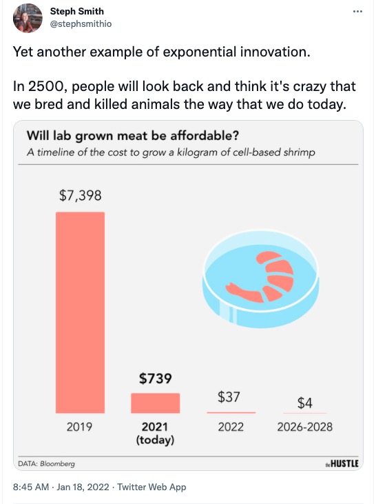
This stat gave me a lot of hope for the future!
Don’t ignore 2 and 3!
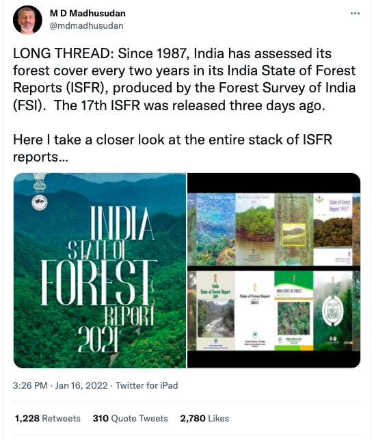
According to periodic reports from the Ministry of Environment and Forests, India’s forest cover has been continually rising since 1999. Great news right?
This long thread dives into the underlying data and uncovers some disturbing truths. It turns out a lot of the increase is due to changes in labelling of what a ‘forest’ constitutes.
Apart from the data, Madhusudan peppers his narrative with pictures, gifs, videos and even Dilbert cartoons. The tone of dark satire is entertaining till the realisation drops: the joke is on us.