Supercharge your data story with messages that are: clear, surprising, relatable and valuable
April 11, 2023
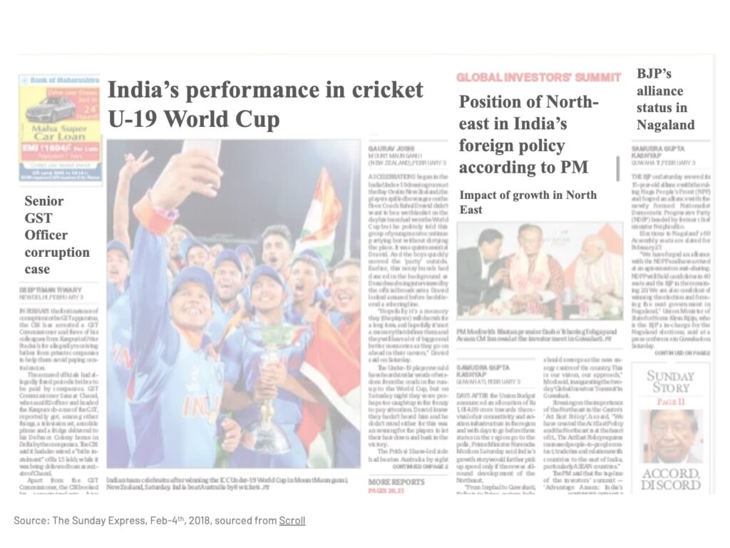
Imagine if you came across a newspaper page like this:
You’d think – gee, why don’t they give the normal descriptive headlines? What do they expect – that we have time to read the entire article to find out what happened in the U-19 World Cup, or why the North East is important?
This is exactly what your audience is thinking when you present a slide like this to them:
What is wrong with this slide you may think? Well, just like the bland newspaper titles, you are making your audience go through the slide contents to figure out the key message on their own.
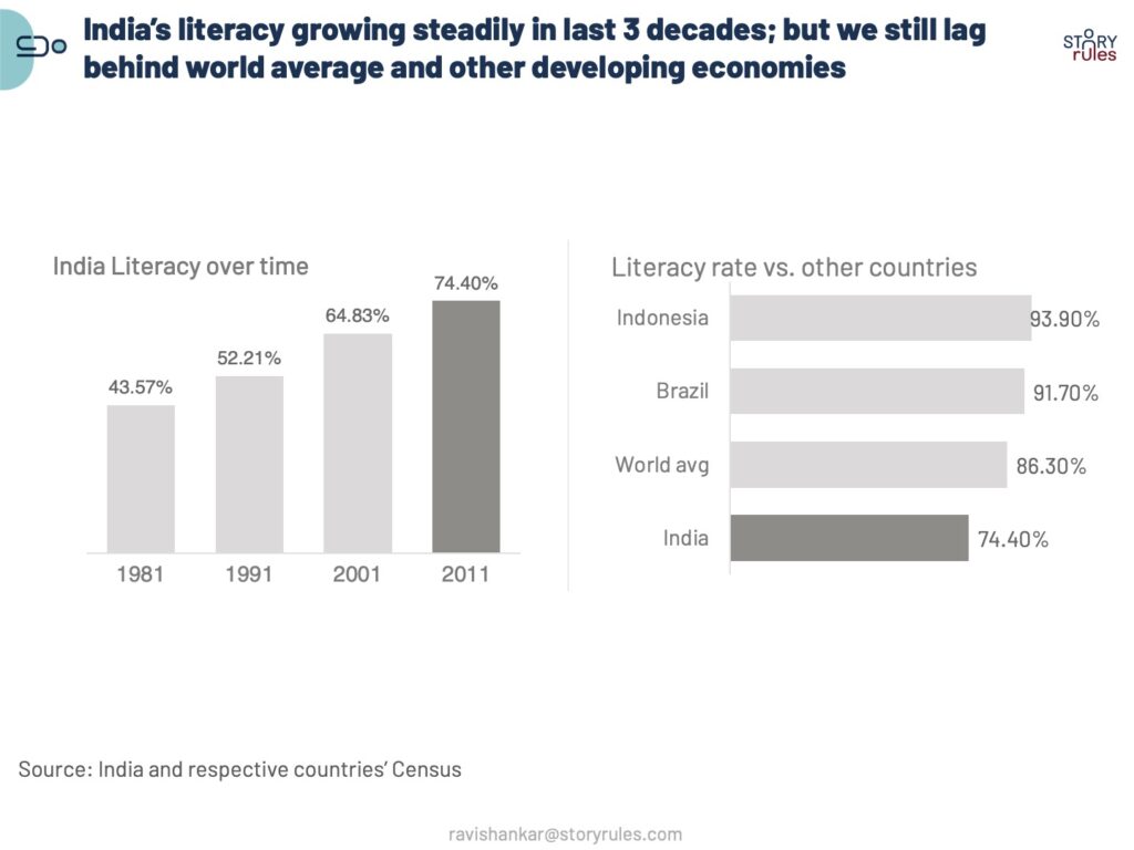
Instead, this is how newspapers actually write their headlines:
And this is how you should also write your slide headlines – as a message, not a title.
Some of you might think – isn’t this too long a sentence? Also, the data seems quite obvious – do we really need to spell it out in a dumbed-down way for our smart audience?
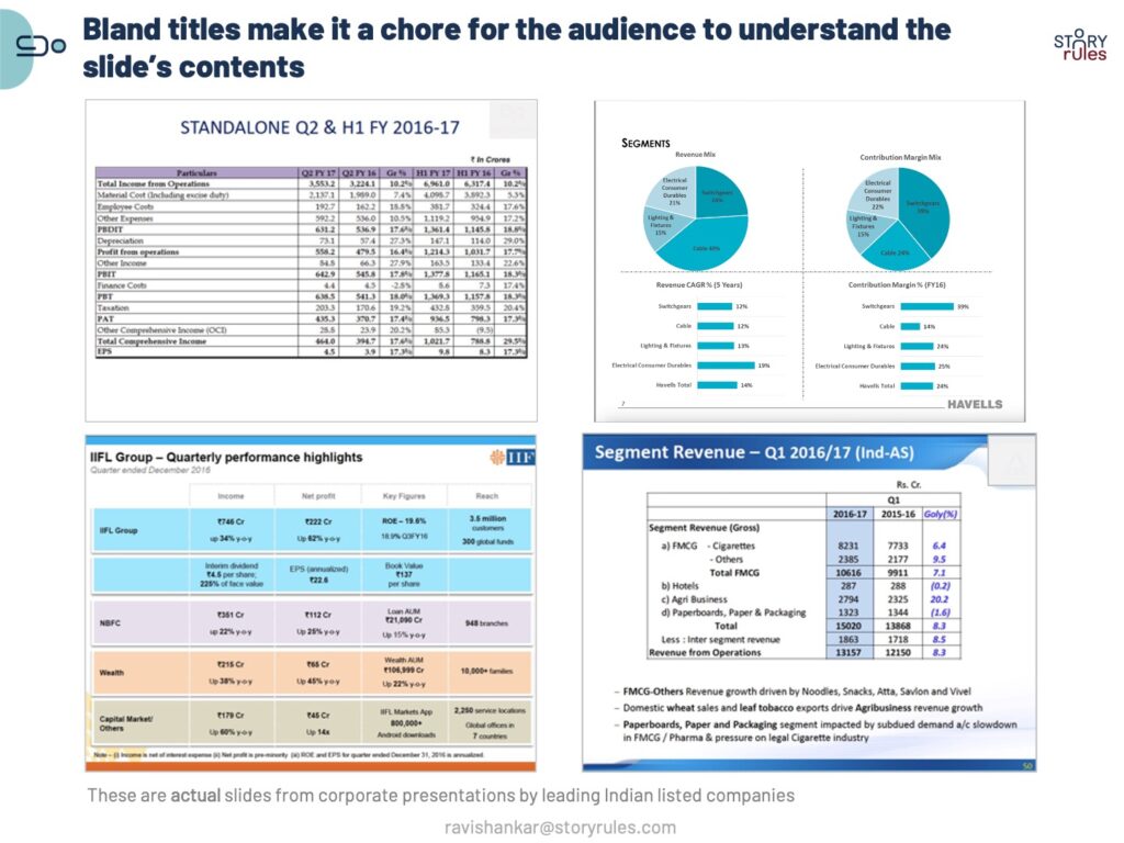
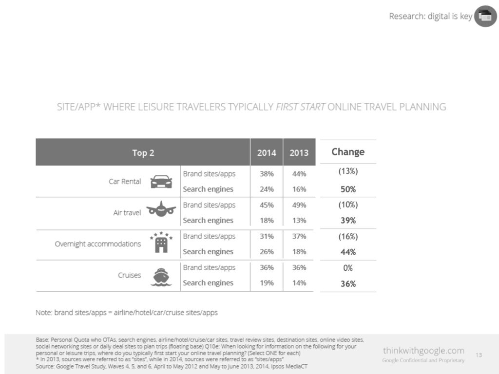
I agree – you may not feel the need for a clear headline on the literacy slide example. But most slides are not as simple as that. Most corporate presentation slides – especially for monthly and quarterly business reviews – tend to be dense and packed to the gills with data, and are a chore for the audience to read and make sense of. Check the following examples:
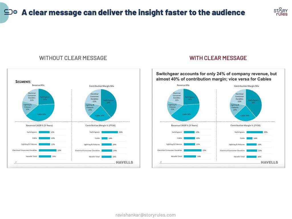
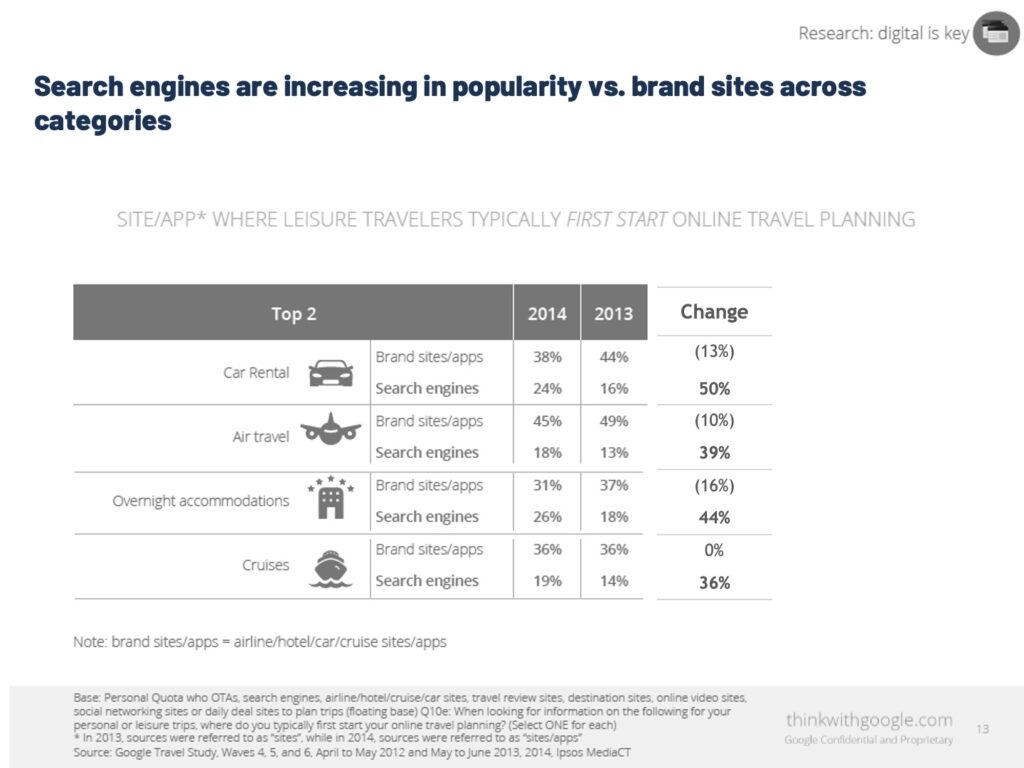
Instead, if you write them as a clear message, not only do you make the audience ‘get’ the data faster, but you also are able to highlight the relevant portion of the data that you think is critical for the audience to know.
Let’s take a look at one more example of a slide without a clear message – before moving ahead, try to ‘derive’ the meaning of the data on your own and track how much time you take in doing so.
Now, read the same slide with a clear message on top:
How much time does it take you now, to figure out the essence of the slide’s data? Undoubtedly it would be a fraction of the time for the previous version. This is the main reason why you should write clear messages on the top of slides instead of bland titles. Also, by clearly calling out the main insight, you are framing the discussion for the audience.
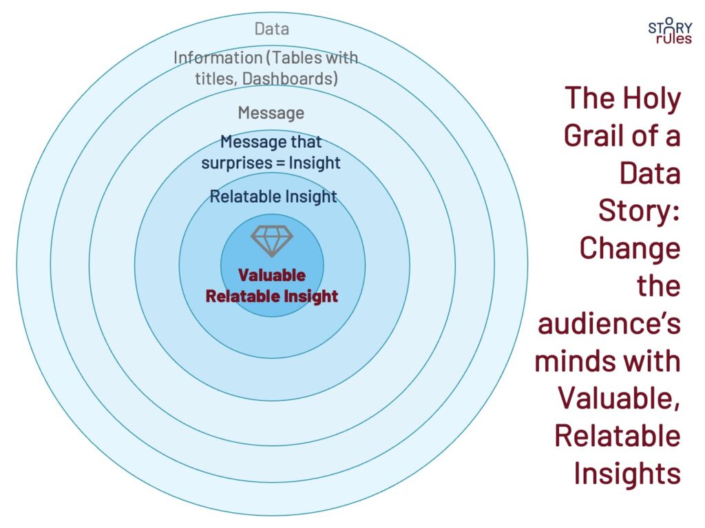
Of course, just having a clear message doesn’t mean that your job is done. It’s time now to introduce the three other elements (apart from clarity) that make a message meaningful: surprise, relatability, and value.
Let’s take surprise first. For a number or a data point to stand out for the audience, you need to contrast that with the right norm. For more on this, please read my earlier post on the concept of norm-variance and the posts tagged as ‘Surprise: Norm-variance‘ on my website.
The second element is relatability: making large or alien numbers relatable to the audience. For instance, during the brouhaha about Elon Musk’s takeover of Twitter, there was talk of the SEC fining him $150M. Prof. Scott Galloway used a superb analogy to make the number relatable: “Even if the SEC acts, $150 million is immaterial to Elon. On a relative basis, his entire $2.5 billion investment in Twitter is about the price of a MacBook for the average household. A $150 million fine is buying an extra charger.“
The third element is value: This answers the question – ‘So-What’ does it mean for my audience? How can this finding drive value for them?
For instance, check out this example where the YouTuber Ali Abdaal shows the value to the audience in a post about a… job opening!
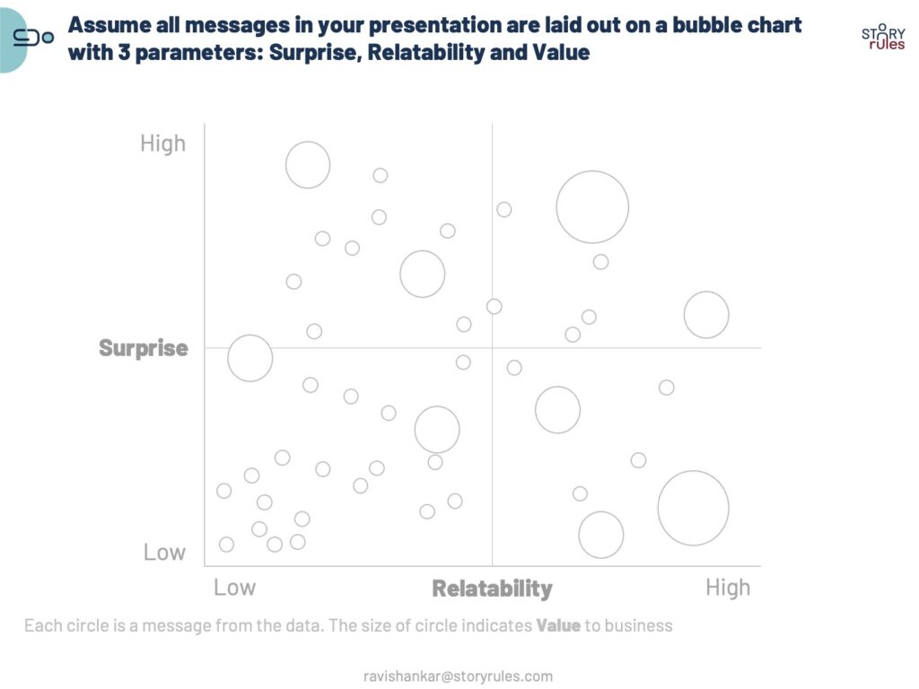
Let’s take a simple example to explore how each of the three elements can be added to a message.
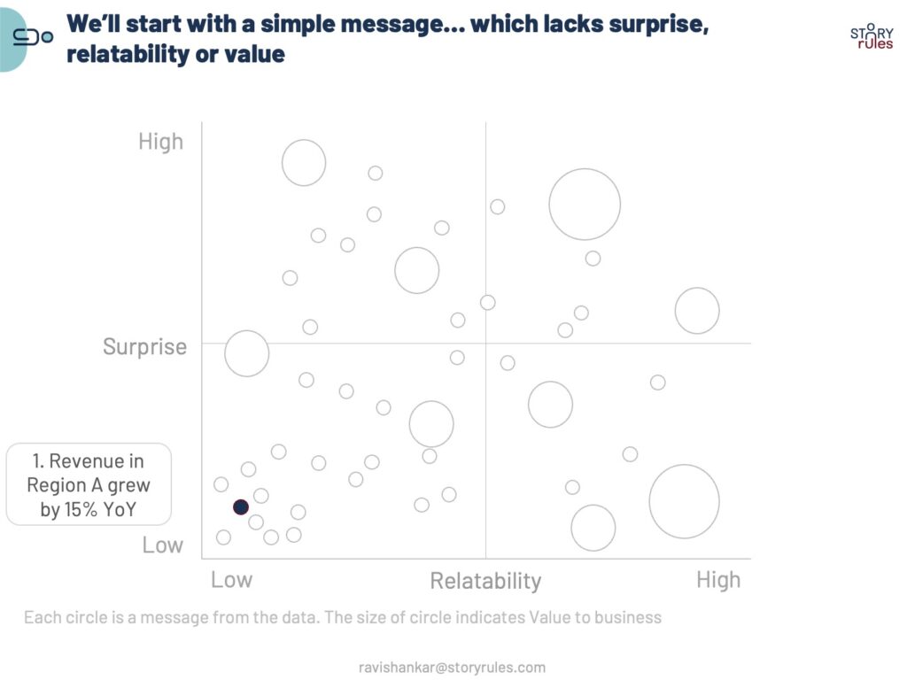
First, let’s use a bubble chart to rank messages on how surprising, relatable, and valuable they can be. In this chart, you’d want to be in the top-right corner as a large circle (i.e. a message which surprises the audience, is relatable for them, and shows them value).
Now, let’s take a simple message like this: Revenue in Region A grew by 15% YoY
This is a message for sure (a title would have been like ‘Revenue performance’). But it doesn’t surprise the audience.
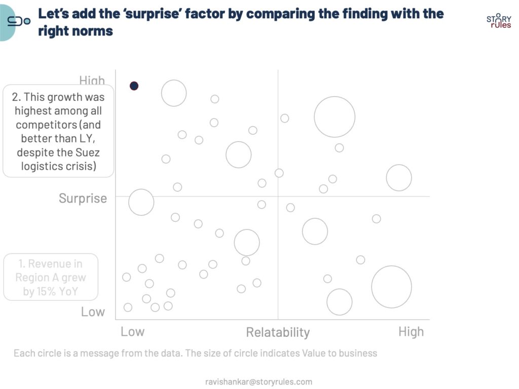
Let’s now add the surprise factor with norm and variance.
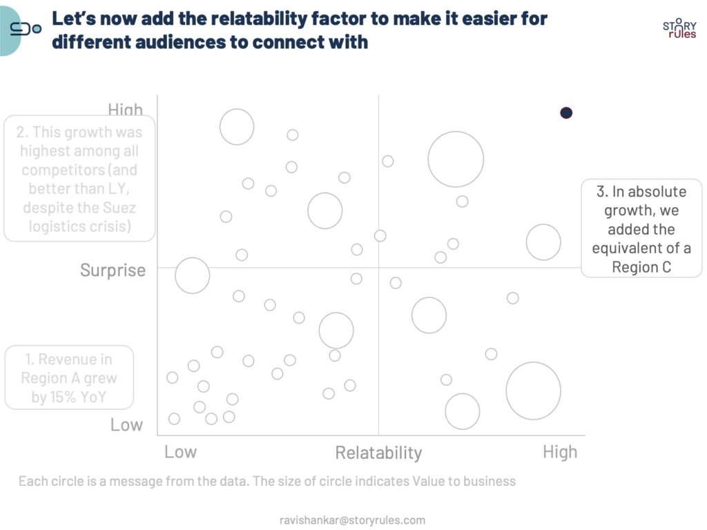
And now, let’s make the message relatable (this would only be needed if the audience wanted a better frame of reference to understand the number). The assumption here is that 15% of Region A’s sales are roughly equal to the entire sales of Region C.
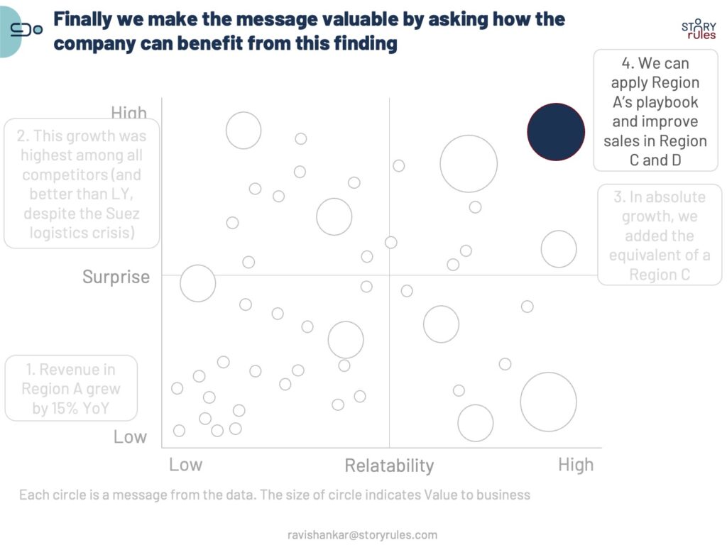
Finally, let’s ask ‘So what’ does it mean to the audience and make it valuable.
There you have it: A message which is clear, surprising, relatable, and valuable. Even if your entire presentation has just 1 of these, you would have made it worth the while of your audience.
In fact, it may be better than many newspaper headlines too!