
3 ideas to tell better data stories in the ChatGPT era

Is my job at risk from AI?
When ChatGPT launched, I had a sense of excitement mixed with unease. I knew this would impact my work (I teach the skills of data and business storytelling to corporate leaders), but couldn’t exactly fathom how.
Then Microsoft announced the launch of their new Copilot tool – with a video that left nothing to the imagination. It was clear that the entire world of knowledge work – thinking, research, analysis, reports, and presentations – will be completely upended with this AI software.
My worry was – would the need to learn storytelling skills become redundant? Would people just be able to ‘outsource’ good storytelling to the AI tool, present the output and wait for the praise to roll in?
I don’t think so.
In fact, I think this is a fabulous development for everyone- presenters, reviewers, and coaches like me.
So I believe that while we have some amazing storytellers among us, the average workplace data stories are still very ordinary. Even today, in leading companies, if you take the average presentation made by senior leaders you will find:
– Data-heavy slides without messages or a coherent flow
– Tables stacked with information, or complex charts that make for tough reading
– Dull delivery
In short, we are still in the ‘Death-by-PowerPoint’ era.
They might as well be telling their audience:

AI will transform this scenario.
Remember the pre-Google era? How research was transformed by this tool? Copilot will do the same for presentations.
But it would also raise the bar – of audience expectations.
And you will need to keep up. This post gives you three ways to do that.
The soon-to-be-outdated way of making presentations
Picture this scene. You have a Quarterly Business Review presentation next week. Normally, this would entail a lot of effort. You will need to:
- Download the data from your ERP
- Spend several hours analysing it
- Reflect on the analysis and come up with a broad structure/storyline
- Create a presentation based on the corporate template and your storyline
- Add the right charts and other visuals
- Prepare to present
- Present
AI will transform this process in the near future.
More specifically, Copilot – Microsoft’s ChatGPT-powered AI tool – will completely upend how we conceptualize and create data presentations at work.

Source: Microsoft blog
The magic ingredient that will power Copilot? Access to your data and MS Office apps like Excel, PowerPoint, Word and Outlook.
ChatGPT uses data from the entire internet – imagine applying its tremendous power to your data.
A new era dawns
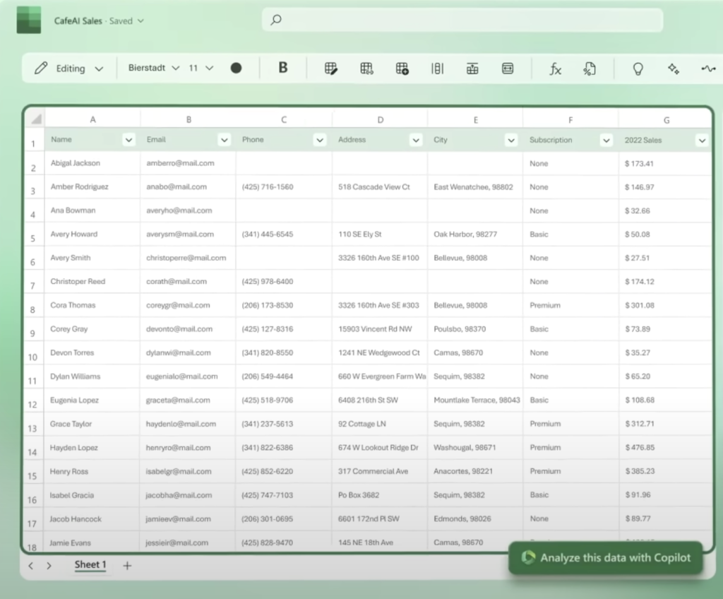
Here’s how creating a data presentation is likely to be in the Copilot age: You download the consolidated metrics file from your system and get to work… instructing Copilot.
Your first prompt could be as vague as – ‘Analyze this data with Copilot’ or ‘What are the key highlights of the last month?’; or something more specific like: ‘How were our collections last month by division vs. the target and last year”
Based on the responses, you ask follow-up questions and the AI gives you further answers.
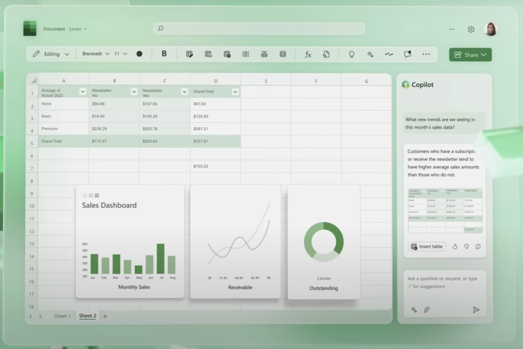
You then ask it to create charts to represent the key data points and then you move to PowerPoint. Here you instruct Copilot to create a 10-slide presentation to depict the monthly performance findings.

You make some edits to the draft slides and voila, you’ve got your review presentation ready – in about a tenth of the time it would have normally taken you, and with much clearer and better-looking slides. Your audience is thrilled.
Or are they?
The expectations – they are a-changin’
AI will forever change the way we make data presentations at work. It would be like how Google transformed research. But it will also raise the bar for all presenters. Senior audiences will start expecting smart analysis, clear messages (or “talking headers”), and simple charts as table stakes. They will want to see more – a coherent storyline, insightful perspectives that make for deeper, richer discussions, and engaging story elements that would keep them interested during the presentation. In short, they would want you to up your storytelling game.
How can you keep up?
Prompts are the key
You will need to become smarter at issuing prompts to Copilot (or other AI tools). For this, you will need to become more conversant with storytelling techniques and tools. You will need to become more curious about the insights hidden in your data. And in some cases, you will need to don a historian’s hat for your area of work.
In short, you will need to go deeper, wider, and higher as a storyteller.
1. Go Deeper: From bland titles to Valuable, Surprising, and Relatable Messages
In an earlier post, I’d written about how you can convert bland titles in your presentation into clear messages that can be made surprising, relatable, and valuable.
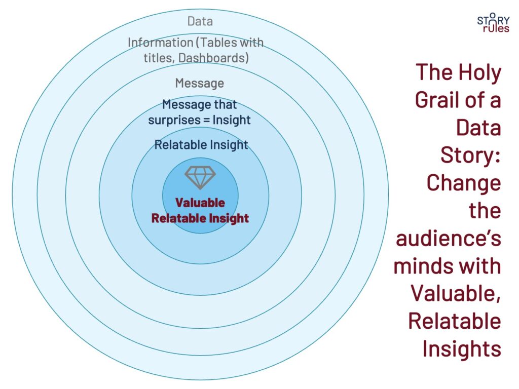
Here’s a simple example that shows the entire journey:
- Bland title: Sales Analysis
- Message: Revenue in Region A grew by 15% YoY
- Insight (Surprising message): This growth was highest among competitors in the region (and better than last year’s growth, despite the Suez logistics crisis)
- Relatable insight: In absolute growth, we added the equivalent of a Region C
- Valuable: We can apply Region A’s playbook and improve sales in Regions B and E
- Final summarised story: Region A’s revenue grew at 15% YoY, making it the highest among competitors (and better than last year’s growth, despite the Suez logistics crisis). In absolute terms, it added the equivalent of a Region C. We can apply Region A’s growth playbook and improve sales in Regions B and E.
Based on this concept, you can change the prompts for the AI tool, asking questions like:
- How much was the growth compared with the competition? (assuming the data exists)
- How was it in comparison with last year’s growth?
- Were there any constraints to growth this quarter?
- Can you make the India growth number relatable for an audience from Europe?
- What are the implications of this finding to help us add value?
A useful guide here is the 6W1H framework – the seven questions that need to be answered by all data stories: What happened, How much, When, Where, Why, Why not and What next.
Check out these three superb examples of the use of the 6W1H framework, which I’d referenced in my short-posts series, #SOTD:
- Leading Indian journalist Shekhar Gupta explains why India was reluctant to condemn Russia in the Ukraine conflict
- Cricinfo statistician S Rajesh concurs that we are in a golden era of bowling in Test cricket
- Financial Times journalist John Burn-Murdoch explaining a surge in Covid cases in the UK in March 2022.
By asking better questions, you are going deeper, building a coherent flow, and converting data into actionable insights.
Bonus points if you can structure the entire story using the 1-3-9 Story Spine!
Alright, that’s about depth. We move on to the next dimension: Width.
2. Go wider: Zoom out your frame of reference
Typically when we analyze information, we look at immediate comparators. For instance, if you are analyzing attrition, based on your corporate template, you might look at data for the last few quarters or at most the last few years.
But what if you widened your frame and went back in time? I mean, really back in time?
For instance, take the increase in interest rates by the US Federal Reserve in early 2022 which triggered a wave of global inflation. If you wanted to analyze that increase, the typical prompt might be: Give me a 5-year (or at most 10-year) view of interest rates.
Jim Grant, one of the foremost experts on US interest rate history widens that frame a bit more with this historical perspective:
The striking thing about the bond market and interest rates is that they tend to rise and fall in generation-length intervals. No other financial security that I know of exhibits that same characteristic. But interest rates have done that going back to the Civil War period, when they fell persistently from 1865 to 1900. They then rose from 1900 to 1920, fell from 1920 or so to 1946, and then rose from 1946 to 1981—and did they ever rise in the last five or 10 years of that 35 year period. Then they fell again from 1981 to 2019-2020.
So each of these cycles was very long-lived. This current one has been, let’s say, 40 years. That’s one-and-a-half successful Wall Street careers. You could be working in this business for a long time and never have seen a bear market in bonds. And I think that that muscle memory has deadened the perception of financial forces that would conspire to lead to higher rates.
Jim Grant in an interview with The Octavian Report
This is a great example of the use of norms – especially the part about going back to 1865! Doing so enables Jim to come up with the fascinating patterns that characterize interest rates and helps explain the current period better.
We often restrict the scope of our comparison to the default frame. But the more you widen your lens, the richer the picture you can get.
Take this example from Ruchir Sharma, currently Chairman of Rockefeller International when he wrote about the Top Ten Trends for 2021:
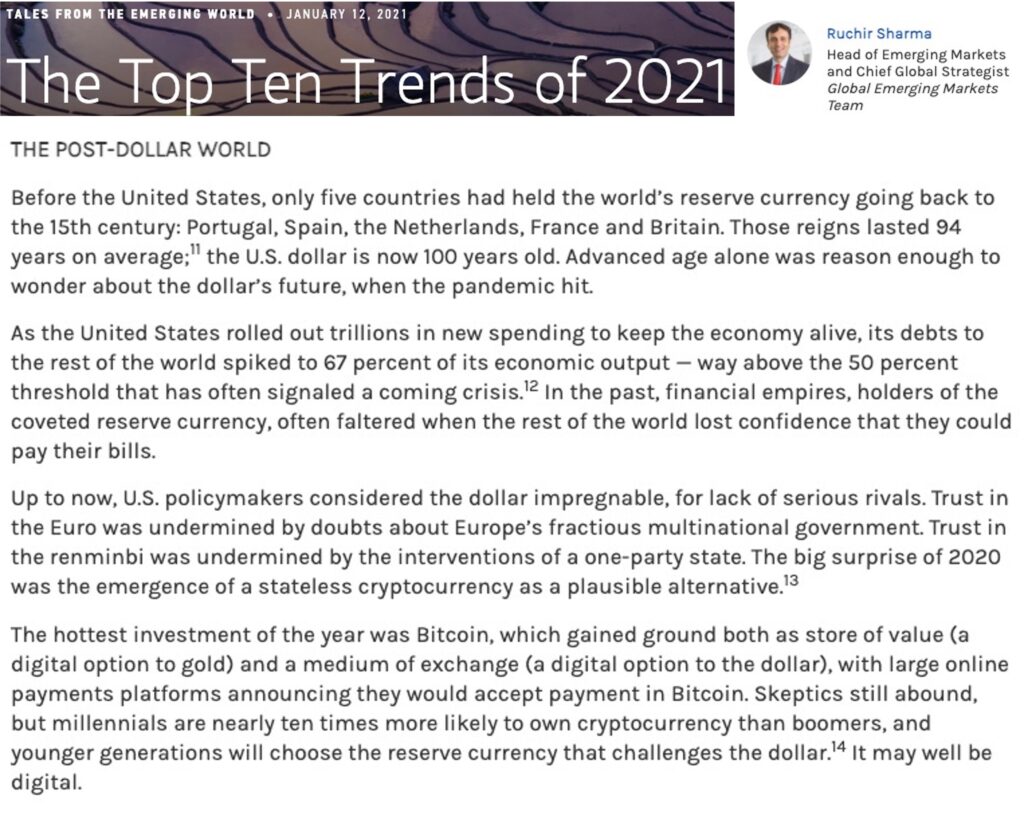
To simplify the above, there are three points Ruchir is making (visuals are mine):
1. Several currencies have served the role of a global reserve currency; the US dollar is past the average reign of currencies that came before it in the last 500 years
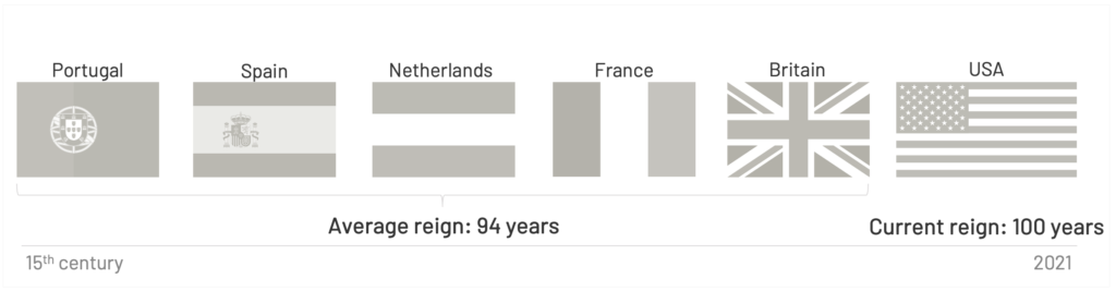
2. The US’ external debt has breached the crisis threshold that typically signals a threat to dominance…
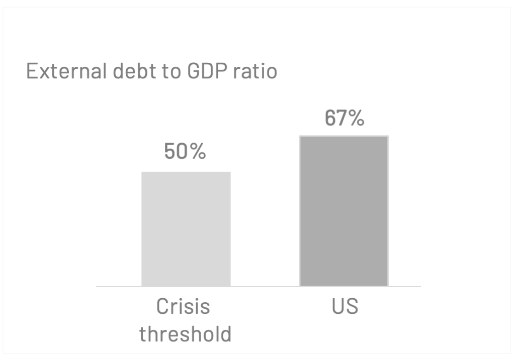
3. …And a new, unencumbered alternative has emerged
Now you may or may not agree with Ruchir’s prediction – but the lesson I took away was his 500-year perspective on the behaviour of global reserve currencies. Now that is a wide frame.
A final example – one that is not numbers-driven. This is an extract from a piece by Novartis CEO, Vas Narasimhan, which was written when the first mRNA Covid vaccines were rolled out.
You might have read the headlines as: ‘Moderna and Pfizer’s mRNA vaccines get approved‘.
But here’s Vas giving us the historical perspective:
When the field of medicine began, early medicines were actually chemicals that we accidentally realized could modulate proteins. Then we learned to design the chemicals to target the protein. Then about 40 years ago, we discovered we could administer proteins to either replace proteins (like insulin) or bind targets in the body (monoclonal antibodies). For decades, we hoped we could move further upstream and use RNA to help the body make proteins or modulate proteins, and we failed often in harnessing the power of RNA.
This year that dream became reality, and those decades of failures progressed the science to success at a time when humanity desperately needs it. We have approved RNA vaccines that will hopefully end this pandemic.
Vas Narsimhan, CEO, Novartis
(For those of you who might have found this technical, hang on – a simple explainer is coming soon in this post.)
A wider lens doesn’t necessarily have to be temporal. One can also use it to look across industries. Let us take the example of Netflix. If you were doing an analysis of Netflix’s revenue, what competition comparators would you use?
I’m guessing you would say: Amazon Prime, Disney Hotstar, Apple TV+, et al.
Let’s think wider: HBO, Cable TV
Let’s think even wider: Movie theatres, dramas, circus acts
Even wider: Video Gaming
Even wider: Social media
Even wider?
“You get a show or a movie you’re really dying to watch, and you end up staying up late at night, so we actually compete with sleep… and we’re winning!”
Reed Hastings, Chairman, Netflix quoted in this Fast Company article
Of course, that was 2017. Things have changed a bit since then. Here’s Scott Galloway writing in a fascinating article titled WMDs (Weapons of Mass Distraction) in May 2022:
What Facebook did to traditional media and Netflix did to cable TV, TikTok is doing to Facebook and Netflix both. The social media/streaming hybrid has quietly become one of the most powerful WMDs in the world, with a production army of a billion users producing its content for free. This unrivaled reserve of energy is refined by an algorithm that is a supercollider of the TV Guide, TiVo, a remote control, and the brain, choosing between billions of programs (globally) in a fraction of a second. Imagine if Netflix reported that it had reduced its content budget from $17 billion to zero … yet still added new users equal to the populations of Japan and the U.K. No need to imagine, that’s TikTok.
Scott Galloway on his blog
A wider lens – either over time or across sectors – can uncover fascinating insights in your data. Make sure you ask the right prompts to find these.
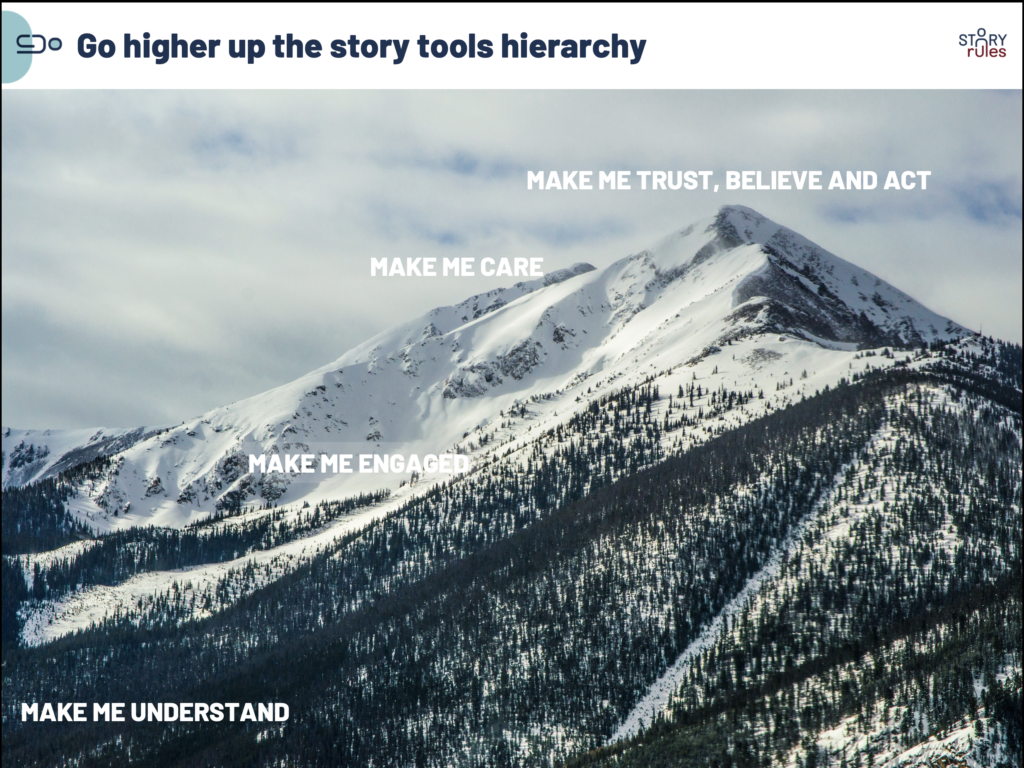
3. Go Higher: in the hierarchy of Storytelling tools
I have written about the four major objectives of stories at work:
- Make the audience Understand
- Make them Engaged
- Make them Care
- Make them Trust, Believe, and Act
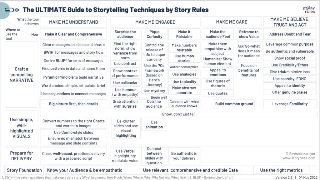
AI tools will make it easy to achieve the ‘Understand‘ goal well. For instance, instead of having to compose one-sentence summaries for your slides yourself, you can ask ChatGPT to do it for you. Instead of figuring out the right charts for your data, you can instruct the AI to choose and create the most relevant visuals.
Again, your audiences will soon start expecting this – to see the ‘Understand’ goal met from your presentations. They would want to see the basics such as: Clear slides with comprehensive messages, a coherent narrative, and simple charts.
And so, to cope with the higher expectations you will need to up your game – by going higher in the storytelling tools hierarchy.
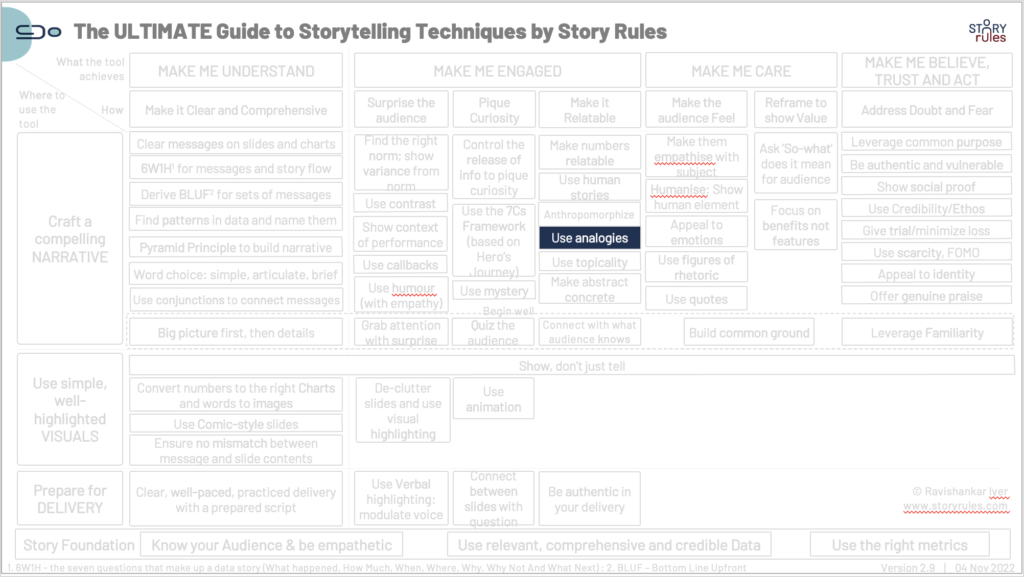
Depending on the presentation goals, audience context, and the data available, you could use several storytelling techniques to achieve the storytelling objectives. For instance, let’s take analogies, which are powerful tools to make content relatable and engaging for the audience.
On that note, let’s get back to the earlier example of the evolution of medicines from chemicals to RNA by Novartis CEO Vas Narasimhan.
In case you found it complex, here’s a simple explainer: Proteins are building blocks of our body that get a lot of stuff done. Think of them as combinations of a few Lego bricks in specific shapes and colours. These Lego-block sets are made by the body using specific instructions – think of these as the Lego instruction booklet – called RNA.
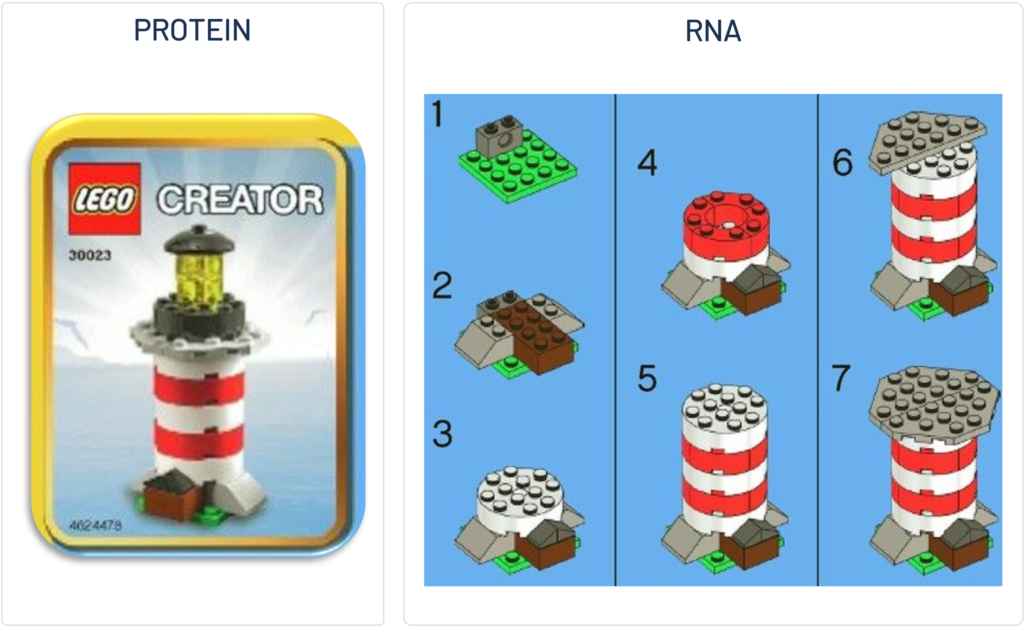
When we take medicines (tablets, capsules, etc.), we are injecting chemicals that interact with the proteins and modulate them – i.e. they make changes to the lego-block sets. Later medical science evolved to manufacture the Lego block sets themselves outside the body – in the form of proteins like insulin – and inject them into the body.
Finally, today we are at a position where we can just send the instruction manual – in the form of RNA – into the body which then “reads” it and makes the desired protein itself.
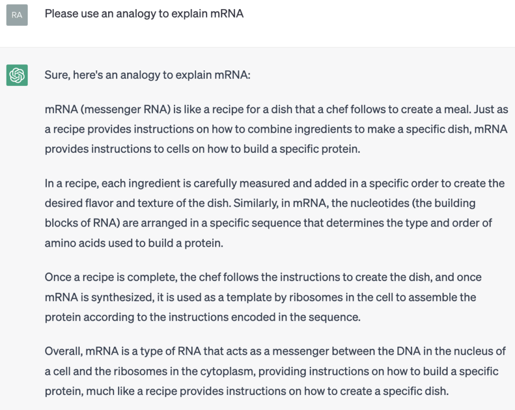
The above was the use of an analogy – one of my favourite storytelling techniques. Interestingly, I did ask ChatGPT for an analogy to describe mRNA. The answer was predictably good:
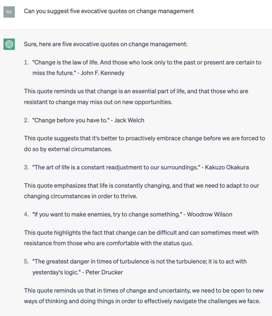
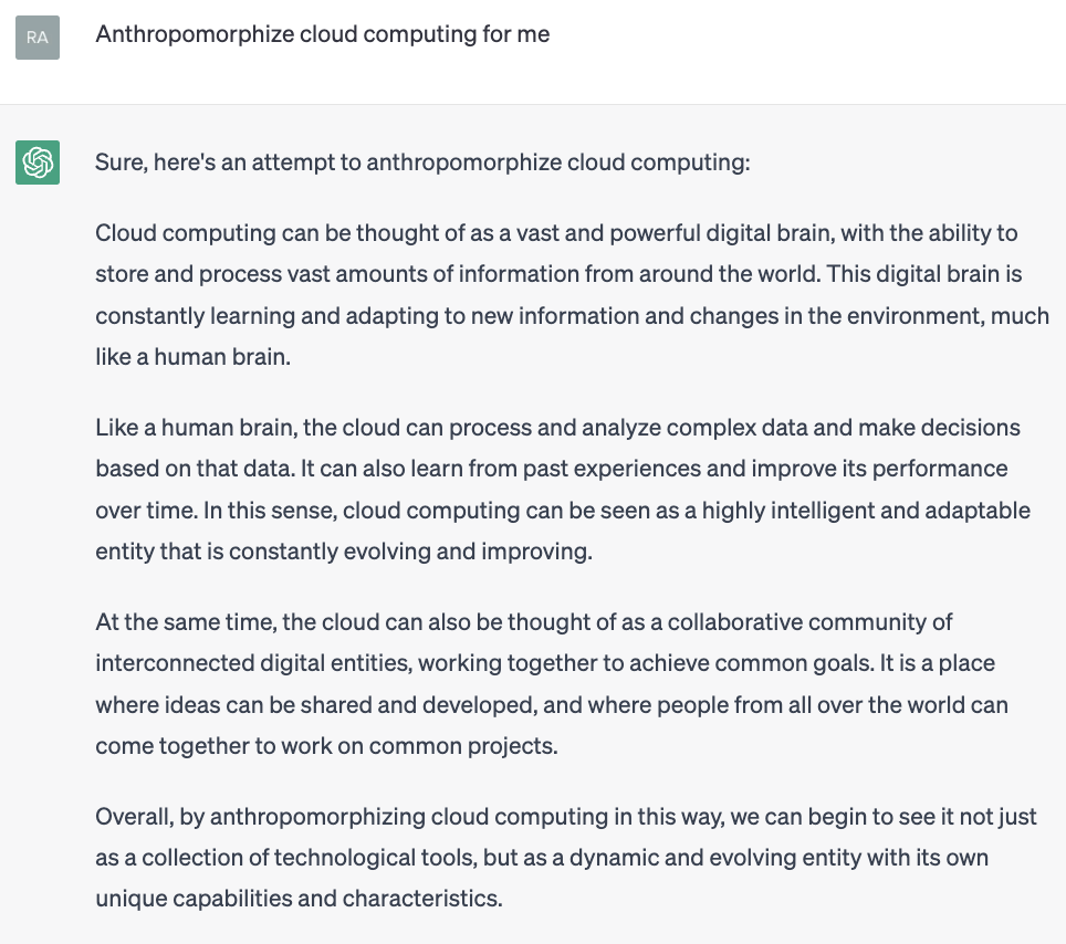
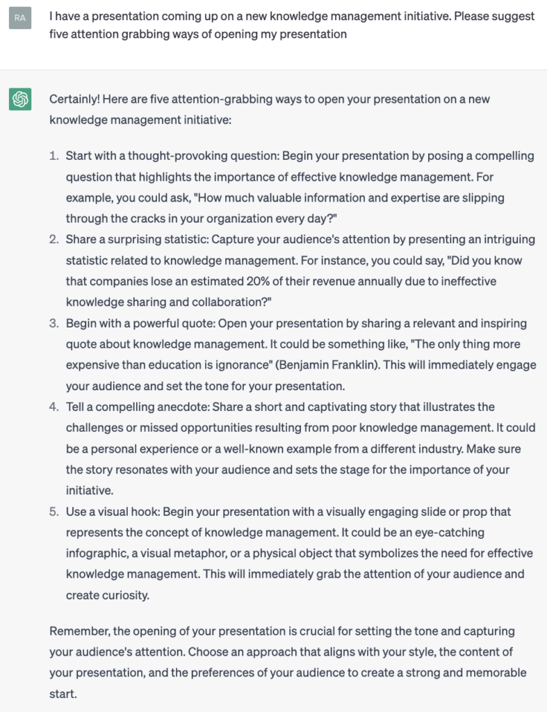
There are several such prompts you can ask the AI to fulfill and use after testing the responses for accuracy. For instance:
- Suggest evocative quotes
- Anthropomorphize
- Begin with a bang
- Craft human interest stories
Ah well, the last one is quite banal and vague. Well, not all prompts will come out fine. Expect a learning curve in writing prompts that work.
Deeper, wider, higher
To sum up: AI tools like Copilot will make it much easier to create data presentations, but they will also increase audience expectations of how impactful they need to be. When AI raises the game, it is time for us to raise ours. We need to go:
- Deeper: Surprising, relatable valuable messages and use the 6W1H framework to craft the narrative
- Wider: Zoom out our frame of reference – across time and sectors
- Higher: Ascend the hierarchy of storytelling tools to engage the audience, make them care, and make them act
There will be struggles and pitfalls along the way, but they can be dealt with.
Here’s the bottom line though: AI-powered data presentations will be here soon. Those who can adapt to this new era will be able to present clearer, more engaging, and more persuasive stories at work.
And I think my job is safe for now!
*****
Featured Image: Photo by Brett Jordan on Unsplash
Related Posts
40 Stories at 40: The e-Book

Supercharge your data story with messages that are: clear, surprising, relatable and valuable

E19: Toshan Tamhane – Lessons from Mckinsey, Meetings and Marathons!

E18: Paul Smith – Bestselling author of books on storytelling

#SOTD 98: A simple visual to compare populations (Amazing Maps)