A leading consumer-goods company has a lot to be proud of – they especially have an exemplary record when it came to shareholder returns.
In fact, they were so proud, that they probably thought “Huh, why bother showcasing it? People will figure it out”
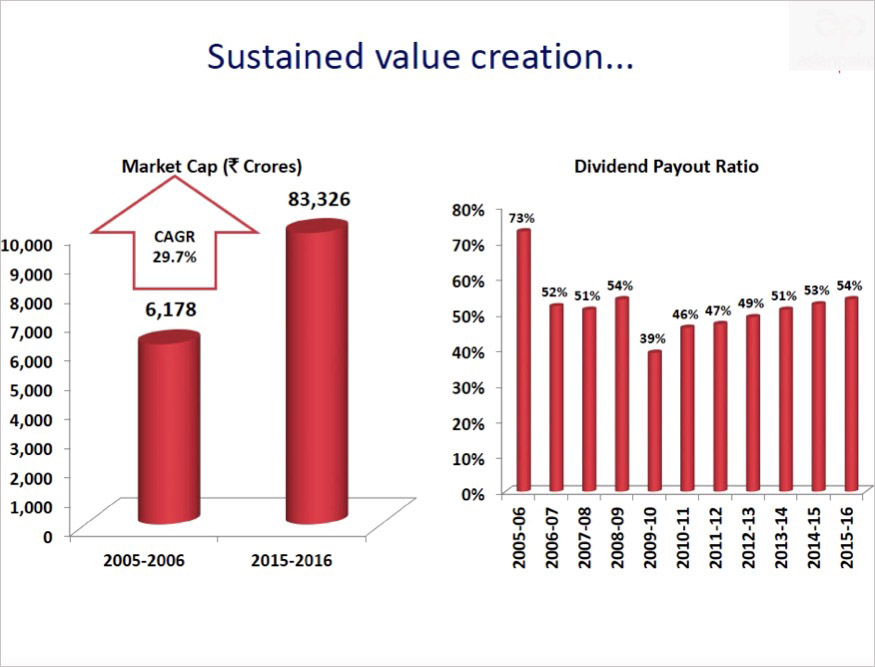
So here’s the slide they used in a recent (November 2016) investor presentation:
Diagnosing the issues
You may be seeing many items of clutter in the charts, but did you notice something really off with the first chart?
You’re right – in order to give decent visibility to the first column (6,178), they cut off the second one (83,326) abruptly. As a result, the visual depiction of the growth in market cap is far lower than the actual growth.
Think about that – even a novice organisation would probably not underplay their performance to this extent. This is a leading consumer company with strong brands – clearly the finance folks didn’t get the memo from marketing.
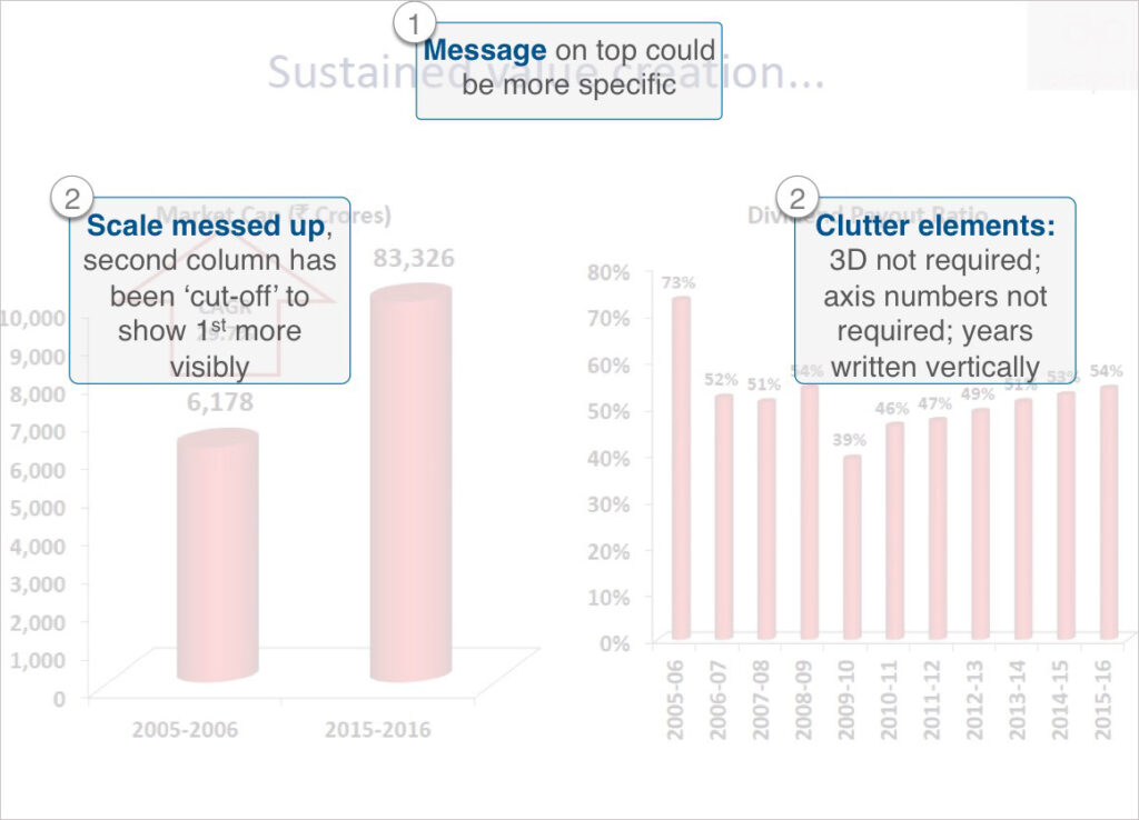
Let’s identify all the issues with the slide:
The Makeover
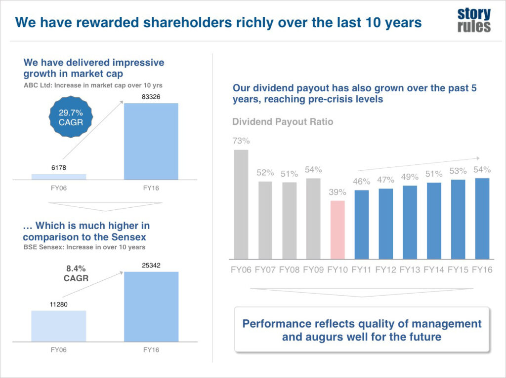
I would remake the slide as follows:
So what did we do differently there?
Clean, clutter free, accurate charts: No unnecessary 3-D charts, Y-axes or vertical labels. Scale clearly reflected.
A benchmark to give perspective: Sure, 29.7% CAGR sounds great, but it becomes more valuable when you give the perspective of the benchmark (Sensex) performance. If you’re presenting in say, a sectoral investment conference, you could show the sectoral index performance.
‘Finding the story’: in the dividend chart, we have identified the ‘story’ – the fact of dividend having risen to pre-crisis levels – and showcased it using colour. You could choose to highlight a different story. But highlight something!
Clear message on top and takeaway at the end: The takeaway implies: “keep investing in us, we perform well!”
The net takeaway from this post: If you have it, flaunt it!
The missing element
But you know what? While this slide may be much better to understand, it is missing something – the emotional element. We’ll tackle that in a later post.
*****
If you found this story useful, please subscribe for email updates of new blog posts from Story Rules.