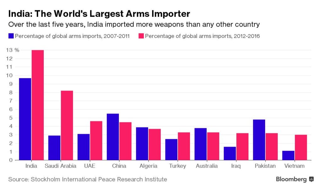
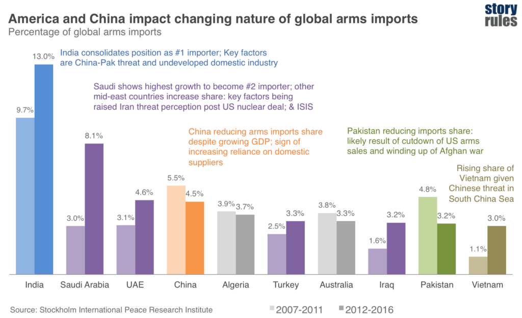
Take a look at this visual that showcases arms imports by country, across two time periods:
First up, the chart isn’t too bad. Fairly clean look, gridlines are in muted in the background, no duplication of Y-axis numbers and data-labels. The message – which is quite simple – is supported clearly when you look at the first red clustered column.
But let’s dig deeper. This chart shows two things:
The share of arms imports by country, and
The movement of the share across two time periods.
The main message only reflects the first of these two aspects. If you strictly look at the message (India being the highest arms importer now), the previous 5-year period data is irrelevant.
So, here’s a tip – once your message is finalised, make the simplest chart possible to reflect that message.
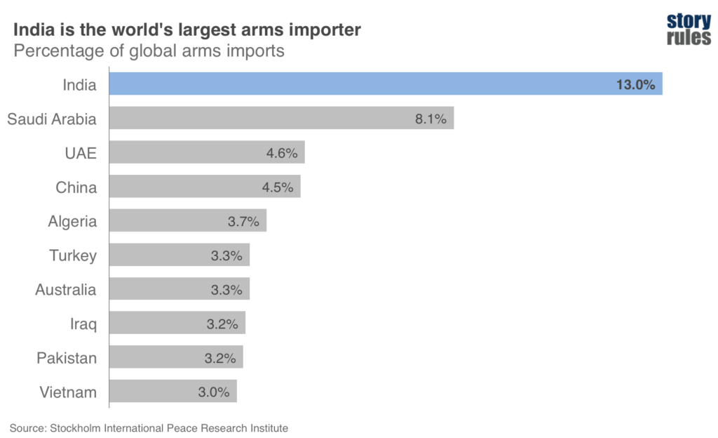
Making the simplest chart for your message
If you just have to show the data to back this message: “India is the world’s largest arms importer”, you could either make a pie chart or as I prefer, a bar chart.
Apart from the ease with which the message is highlighted, notice one key advantage of the bar chart: the country labels are so much more easier to read (as compared to a pie chart).
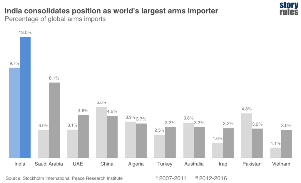
What if I want to show both?
Having said that, what if you want to show both – the split by country and the movement over time?
Sure you can – but then the message should reflect that. Let’s examine what’s happening with India’s imports over the two time periods… We realise that, even in the previous 5-year period, India was the largest arms importer; and has in fact consolidated its #1 position. Well then, why don’t we state that as our main message:
“India consolidates position as world’s leading arms importer”
What about the chart then? We could use the same clustered column chart, but with one small change: highlighting the main message, and pushing everything else into the background.
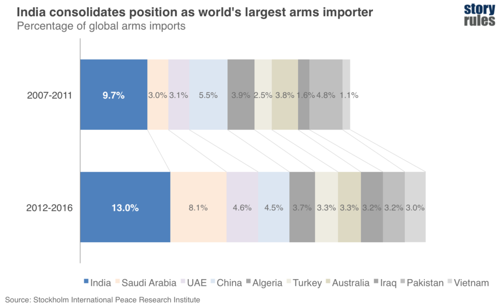
For some people though, the clustered-column chart can be a bit cumbersome to read, especially if you want to compare across countries quickly. Another option, when comparing two or more component (i.e. percentage share) pieces, is the stacked bar or stacked column:
The stacking allows you to see two things clearly
Quickly compare share across countries within one time period
See that the total imports of the group as a whole, has also increased – by about 10%.
It does have a limitation as compared to the clustered chart though – identifying the component by country takes a little more effort (although, to minimise the effort, the legend is lined up in the bottom of the chart, in sync with the components).
What if I want show many messages from the same chart?
Ideally you should focus on one key message per chart, but sometimes you have charts that throw up multiple messages; and it becomes difficult to decide which one to focus on. In that case, one of these following questions should help you decide
“What will my audience care about most deeply in this data?” (for instance, if you are presenting to an audience in Iran, you know which bars to highlight – all the Mid-East countries surrounding it)
“What message in this data helps me move my overall story forward in the direction I want to?” (if your overall story is one of increasing domestic production of arms, you would highlight the China case)
Having said that, if you are presenting to a neutral audience; or if the data is part of a report that will be read by a wide audience, you may want to highlight different messages from the same chart.
Normally I prefer to create a different chart for each message. But in this case, it is possible to show multiple (sub-)messages in the same chart. Remember however, to consolidate the ‘sub-messages’ into an over-arching big-picture message.
So, here goes an attempt to interpret what’s going on in the world of arms imports (at which I am a certified, wait-for-it, arm-chair expert):
(By the way, seriously, I have no clue of international geo-politics. Please do not base your decision of setting up a weapons manufacturing unit in Greater Noida based on the above.)
(China may not be a bad idea though).
Anyway, the idea behind showing this revised visual is to encourage you to show the ‘story’ behind the data, by using these ‘explainer-text boxes’ (where possible).
Summing up
And so, to sum up the key tips in this post:
Once your message is finalised, make the simplest chart possible for that message
Focus on one key message per chart. Choose the same based on your audience and your overall story.
If you want to showcase multiple messages, use explainer-texts to highlight them, but distil a clear ‘main message’ on top
And finally, the next time you see a seemingly simple, arm-aadmi chart, look a little closer – you may just discover an interesting (geo-politcal) story that can be evocatively told.
*****
Featured image: By U.S. Navy photo by Mass Communication Specialist 1st Class Denny Cantrell [Public domain], via Wikimedia Commons


