Business leaders: Don’t settle for less during review meetings
This post is about a most common activity that business leaders engage in: attending review meetings. I think the existing format is ineffective and needs a significant overhaul. Let’s look at two examples that I came across.
Story 1: An emerging technology company
“Whenever a presentation needs to be made, the CEO calls me” stated Frank* proudly, as he browsed through his laptop to show me some decks he had made. He was part of a 20-participant batch undergoing training in better storytelling techniques at a rising technology company. Frank opened a document and ran me through the slides. He was clearly impressed with his work.
I, on the other hand, was gobsmacked. Each slide was absolutely filled to the gills with text and numbers. It was like a detailed word report on a slide. How were the audience meant to read (much less absorb) this, while the speaker would be holding forth during the session?
And if the company’s CEO was referring to this as the ‘good presentation’, what would be a bad one, I shuddered?
Story 2: A leading services company
In another company I worked with, the quarterly business reviews would consist of presentations packed with detailed data-tables, copy-pasted from Excel. Clearly, the leadership team would’ve been overwhelmed looking at them and were unlikely to have meaningful discussions.
But there was another issue. By just showing the data in raw form, and not diving deeper into the underlying drivers of performance, there were multiple instances of inaccurate diagnoses. Business leaders would routinely attribute Factor X as the performance driver, when in fact, it was Factor Y or Z. This was not deliberate – but it was still happening. Why?
What’s the issue: Skills, Masochism or Obfuscation?
Why do CEOs/business leaders settle for (and sometimes actually encourage) such complex, cluttered outputs? There could be three reasons:
1. Lack of Skills: They don’t think their employees have the skills to craft a story from the data, and so they ask them to show everything
2. Masochism: You read that right. Some leaders believe that they can just ‘power through’ the discussion and extract meaning/insights from the data despite the cluttered slides, not because of them
3. Fear of Obfuscation: Leaders worry that if the employee isn’t showing ALL the information at once, he/she might be hiding something
Let’s go in reverse order on the reasons above.
– Regarding #3 – it is a genuine concern. I have attended many business meetings where employees would selectively highlight positive business metrics and conveniently leave out the troublesome ones. (It’s a natural reaction – ‘If you can’t convince them, confuse them’!). To address this, it is important to have a format/template of the base minimum metrics to be covered. But having such a template doesn’t mean just dumping these metrics on the audience on one big ‘Dashboard’ slide. Underlying the metrics, there would be a story in the data – it is the presenter’s job to unearth that story and present it clearly and visually.
– On #2, there’s not much that can be done to address the bravado of a masochistic leader! All I would say is that we need to recognise that all of us have limits to our information-processing ability. Let go of the bravado. Demand clear communication from your colleagues… Your busy, information-loaded days don’t need to be hijacked by cluttered slides and long-winded, unclear emails.
– Which brings us to #1. Can your employees learn to become better storytellers even if they naturally aren’t so? Of course they can. With encouragement from the top, desire to learn from their side and the right storytelling coach (ahem), you can transform the quality of your review discussions.
An example
Let’s take an indicative example to illustrate the above. Abacus Tech is an IT services company and runs a process for a US based client. Its project manager makes a quarterly presentation to the US Client coordinator about Abacus’ work. This primarily involves dealing with ‘tasks’ raised by the clients employees and how well does Abacus service them.
The last quarter was especially busy for Abacus’ team as they did 441 tasks. The project manager (let’s call her Sneha) prepared the usual ‘dashboard’ report for her client counterpart.
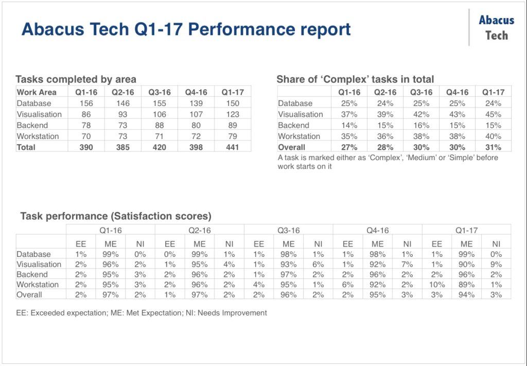
That’s got all the information, sure. But imagine the client coordinator trying to make sense of all those numbers, while Sneha talks through the slide. Definitely not impactful.
On the other hand, let’s say Sneha applies storytelling principles to extract and then present the story from her data. Here’s how the same slide could look:
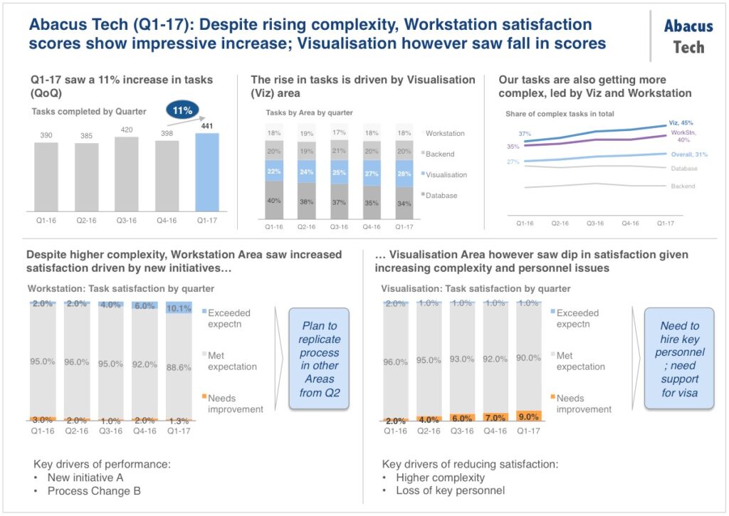
Let’s assume the above slide was emailed over to the client before the review. Imagine if you were the client, reading through this slide. Would you have any confusion in understanding the story of Abacus’ performance? I don’t think so.
Admittedly, the slide does look packed if we were to present it in person/over a call. However, even in that situation, there are two options:
– Sneha can keep each chart on a separate slide, so that the audience isn’t overwhelmed with too much on one slide
– If there is a restriction on number of slides (and she can use just 1 slide), then she can animate the charts, so that they come in the right sequence.
Time is money
Business leaders – you are right. You may be able to ‘extract’ the story yourself even from a cluttered, data-heavy slide. But it will take you much longer than it should. Your time is precious. You need to spend more time discussing the root causes of performance and not in trying to derive them yourselves.
Ensure that your presenters (and you yourself!) are skilled in the art of crafting, preparing and delivering an impactful story with their data. You will get insightful presentations, richer discussions and ultimately better business outcomes.
*****
* All names changed
