
Constructing the right chart
A leading construction major had this slide in its recent investor presentation:
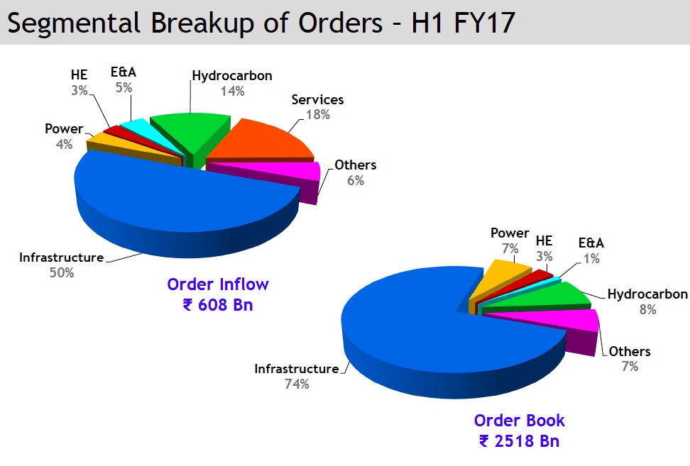
Looks pretty harmless, eh? Two nice 3-D exploding pies, lots of colour.
Let’s see what we can do to make it better.
(Before we start, a quick primer about the terms: This is a construction company which works on multi-year projects. ‘Order Inflow’ refers to the total amount of new project orders generated in the first half of FY17. The ‘Order Book’ is the total ‘stock’ of orders on the last day of the period. New order inflows keep adding to the order book, while orders ‘executed’ will reduce from the order book)
There are a few issues in the slide that we will try and address:
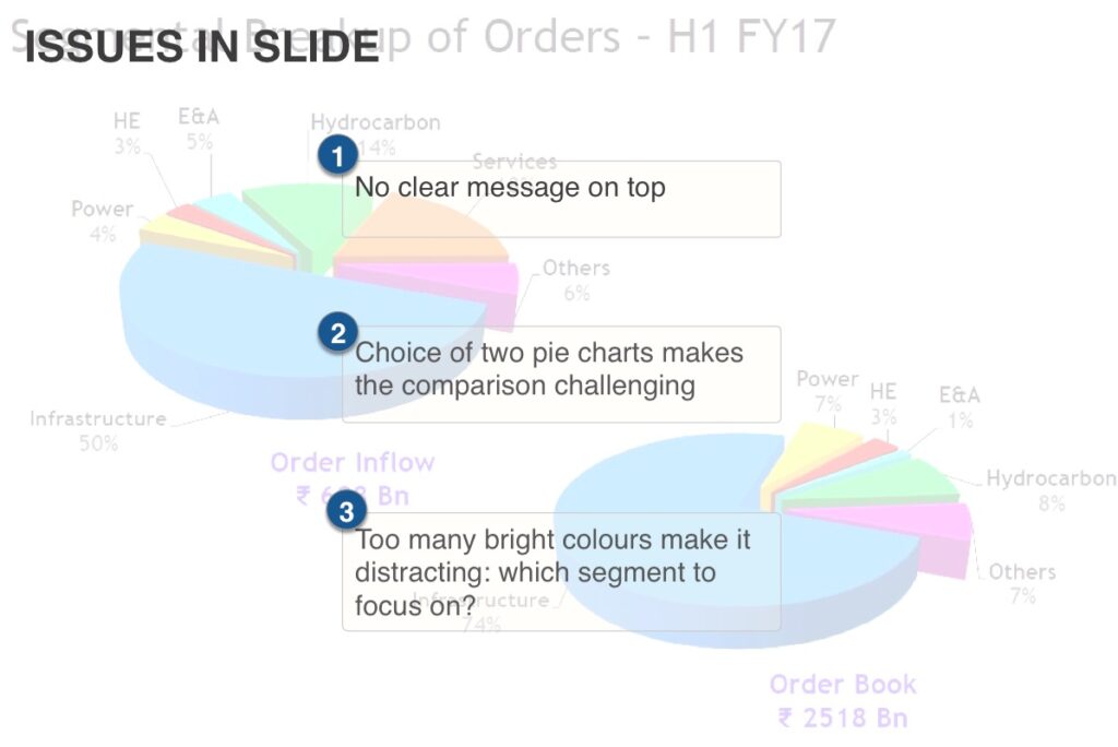
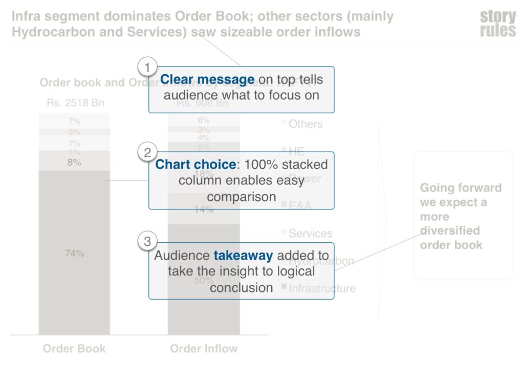
The lack of a clear message on top is a common issue on many slides: What is it about the ‘Segmental breakup of orders – H1FY17’ that you want me to notice?
The other issue is relating to choice of charts. When it comes to pie-charts, the only reason to be having two pies is if you’re having many guests for dinner. Otherwise, when it comes to comparing between two sets of 100% components, it is best to build a stacked bar or column.
Slide makeover
Here’s the revised slide:
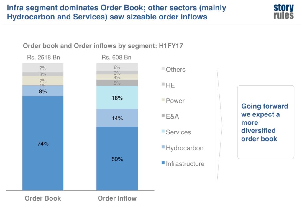
So what did we do differently here?
You’ll also notice the following:
- The stacked column makes it much easier to compare components across the two data sets. Notice a small advantage: the legend is lined up right next to the components and makes it easier to ‘read them’.
- All chart elements which were not critical are ‘in the background’ in a light grey colour.
- The takeaway box at the end answers the critical ‘so-what?’ question. The audience may ask “Sure, you have got some data on order inflow and order book, but ‘so what’? How does it impact us as current/potential investors?”. The takeaway makes your point clearly: A changing order-inflow mix clearly indicates that other sectors are showing higher growth and would lead to a more diversified order book in the future, thus de-risking revenue generation.
Featured image credit: By Evan-Amos (Own work) [CC BY-SA 3.0], via Wikimedia Commons


