Are you smarter than a chimpanzee?

How do you effectively communicate a data set like this?

That table contains life-expectancy data for 50 countries, for the period 1960-2014. It is deliberately kept hazy and tough to read – imagine trying to show it on a chart.
Apart from their enormity, there is another challenge when it comes to disseminating such data sets – on development outcomes such as life expectancy, female fertility and income levels – they are inherently “boring”. Entities such as UNDP, World Bank and WHO have been publishing multiple reports that run into reams of paper over the decades – and yet, despite free availability of the data, public awareness of these indicators is woefully poor.
One Swedish professor working in the domain of public health decided to do something about it. This was Professor Hans Rosling, whose famous TED talks have been watched by millions (you may have also seen them).
Unfortunately Professor Rosling passed away recently on 7th February, prompting a raft of tributes on Twitter.
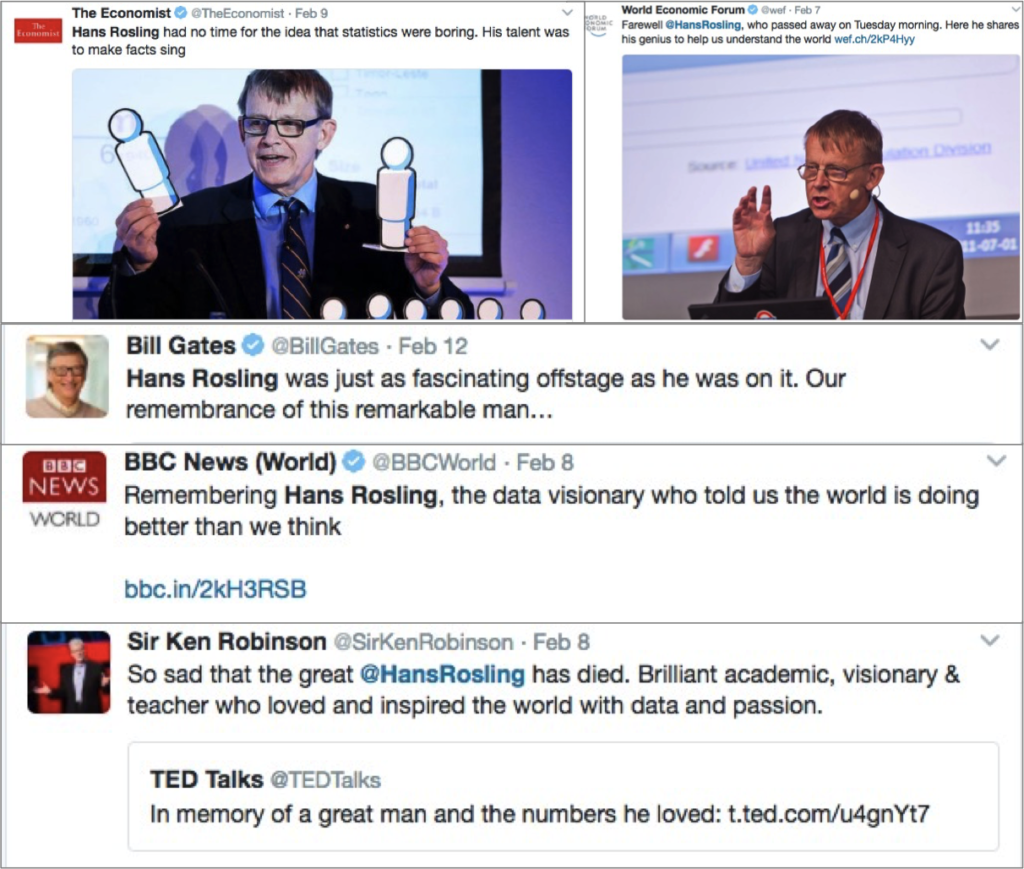
In case you thought the reason for his popularity was because he was like a dashing ‘Robert-Langdon-type’ who would rock the stage, take a look at this picture:
You see a frail old man, with hunched shoulders, wearing a crumpled, ill-fitting suit – this is the guy people are raving about?
Ah, but you have to see him deliver his talk.
Now might be a good time to watch the most popular Hans Rosling TED talk (in case you haven’t already) delivered way back in Feb 2006:
So, what did they do there?
A revolutionary way of showing the data
For decades we only knew 2D charts – until Ola Rosling (the professor’s son) decided to build charts with a third dimension: time. The motion charts used by Gapminder Foundation in the video, are absolutely striking and bring the data alive and kicking. (see from 2:25 in the video)
That sportscaster-delivery
Of course the charts probably cause only 20% of the impact – the rest is due to that gobsmacking delivery style! (see from 4:00 in the video). When the data points on the chart start moving, Rosling transforms – from a meek, genial professor, to a vibrant, bubbling sportscaster. The time dimension brings the data alive, and Rosling capitalises by bringing urgency in his voice (“ALL the green Latin American countries are moving towards smaller families”), adding emphasis and wonder (“But now, Bangladesh — it’s a MIRACLE that happens in the ’80s: the imams start to promote family planning. They move up into that corner.”).
It is a masterful performance, and probably the main reason why people love this talk so much.
Of course, what also works for Professor Rosling is his innate charm and that goofy, 100% genuine demeanour. Wearing crumpled, ill-fitting dresses, he probably breaks every law of attire and ‘presentability’ when public speaking. But the command over his delivery and the unique style more than make up for it.
Having said that, a caveat: As much as one can love this performance, it is not something that everyone can ape. The learning from this performance is not to dress like him or copy his delivery style. The idea is to be yourself – discover your own true style by showcasing your genuine enthusiasm and fascination for the data being presented.
Some other talks
Now that you’ve been initiated into the Hans-Rosling-Fan-Club, here are a few more of his iconic talks:
This was one of the latest, in which he riffs off some old hits like the chimps joke:
And this one was in TED India in 2009:
So, in addition to the factors mentioned earlier (unique data visuals and sportscaster-like delivery), a few more useful tips from his talks:
Humour
If you look hard enough you’ll find a few laughs in any data set. For instance in the second talk, when people have to choose among three options, most Swedes get it wrong. A masterstroke was his insight – even if you assign equal probabilities to each option, at least 33% should go to the right one. Most of us would have used the analogy of a random choice between 3 options. But here’s where the good professor was clever, and made an imaginary experiment – of getting chimpanzees in a zoo to pick choices at random (as a small addition to the presentation, I would’ve put a picture of a chimpanzee holding a piece of paper – to visually reinforce the message). That way he could make the absurd yet accurate claim that chimpanzees were “smarter” than the average Swedish citizen/student/professor etc. I love the line in the second talk “because the chimps don’t watch the evening news you know, so they assign choices at random”
In your own work too, if you come across such a large gap between perception and reality, it might be a good trick to use, especially when presenting to a large audience. (Needless to say, be careful of not offending the audience though!)
The professor also was not repeating his jokes. For instance, when he was comparing the audience-poll answers to the correct one, he said “You were beaten by the chimps. But it was close. You were three times better than the Swedes, but that’s not enough. You shouldn’t compare yourself to Swedes. You must have higher ambitions in the world“
For a later question, when the poor Swedish folks again get it wrong, he thunders “WHO THE HECK is the Professor of Global Health in that country?“, before meekly admitting “Well its me“. Self-deprecation for himself and his country works like a charm to generate laughter.
Perspective
In another case, when he admits to testing the professors at the Karolinska Institut (who also get it wrong), he emphasises, after a pause “the Institute which hands out the Nobel prize in medicine”. Why is that important? It is a powerful way of making his point – that these guys, who are deciding who should win the most prestigious award in medicine, are unaware of basic health data about the world they live in.
Gimmicks/props
The use of the long analog pointer instead of the standard laser variant was pure genius – and totally goes with his droll personality. Beware though – it is unlikely to work for others who may try it.
A small issue
This may seem like nitpicking, but there is a significant data-visualisation error that creeps in his India TED Talk. Can you spot it in this chart?
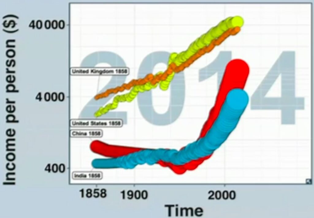
You’re right – the Y-axis scale is all messed up. It is a semi-log chart where the Y-axis is set to a logarithmic scale. Without any clear indication however, it is visually very misleading as it gives the impression that China and India will catch up to the US and UK in a very short period of time.
But you know what – let’s cut the Professor some slack. The scale of his achievements dwarfs marginal issues such as these. And leaves us with a memorable legacy.
Legacy
Dr. Rosling may have left us, but his legacy – of looking at the data in entirety, of not getting swayed by biases and extreme events and most importantly, of using innovative, entertaining techniques for communicating critical data – would live on through the Gapminder Foundation, and everyone who gets inspired by him.