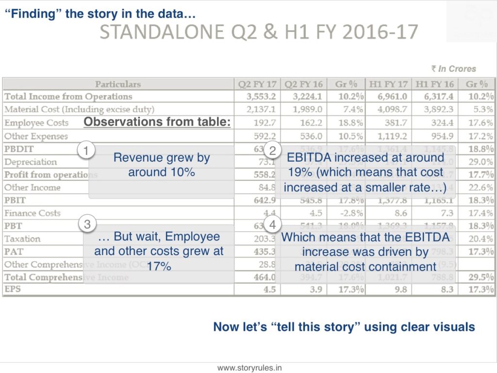
A leading Indian company (one that’s been awarded by the CA Institute for excellence in financial reporting), put out this slide in a recent analyst presentation:
A slide which follows the typical “who-knows-what-could-be-important-so-let’s-show-everything” approach. A slide which has 16 rows and 6 columns – 96 data sets in all. Good luck if you expect the audience to remember even one of them.
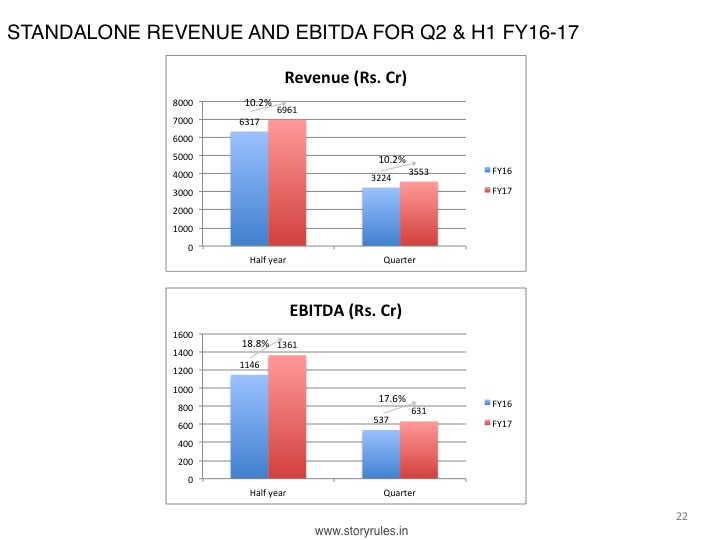
You might say, ‘tables are tough to read, a chart is better’ and use the default charting application to come up with this:
That’s not much better is it? Multiple colours, bars, numbers and lines everywhere – what do you want the reader to focus on here?
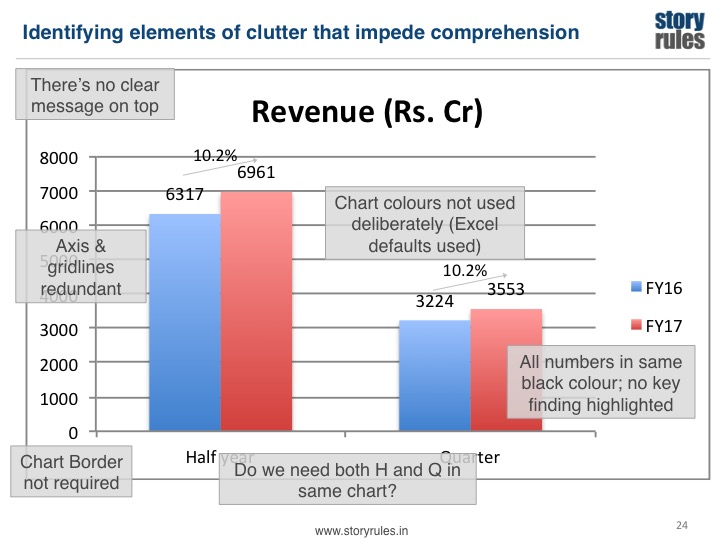
Even if you simplify and just show the revenue and EBITDA numbers, as below…
… it still retains multiple elements of ‘clutter’. Clutter is any element which exists on the slide but doesn’t add any/adequate value. Let’s identify some of these elements:
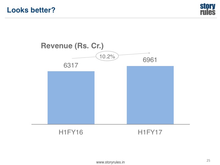
Perhaps if we clean up the chart, it’ll become easier to comprehend:
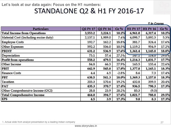
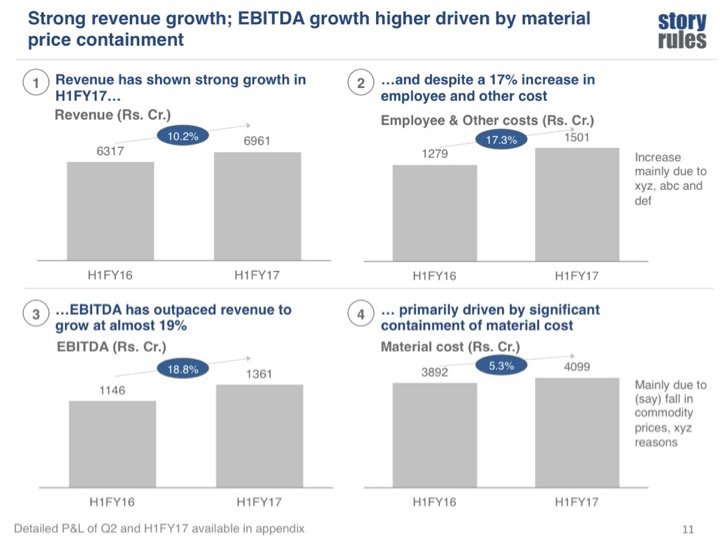
That does look better. But it is still just a couple of data points. What is the overall story we want to tell here? Let’s go back to the P&L table:
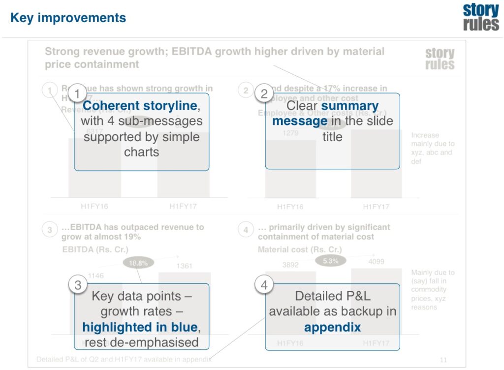
That’s much clearer, right? Let’s examine some of the changes made in this slide:
So that’s our first example of a ‘slide makeover’ by Story Rules – where we will periodically look at actual corporate slides/presentations (taken from the public domain) and examine how we could improve them.