How to present complex, technical information in a captivating way

How to present complex, technical information in a captivating way
The answer is V. SARALe. Confused, especially about the ungainly extra ‘e’? Read on.
Even if you aren’t a scientist or technologist, ever so often, you may find yourself presenting your work containing complex, technical concepts to a layperson/non-technical audience. Suddenly all that jargon that you comfortably threw around, becomes a bottleneck; and you get blank looks and fidgety fingers. Instead of your audience’s minds, their smartphones start getting unlocked and before you know it, you’ve lost them.
In such a situation how can you ensure that, not only does audience get your message, but they are also engaged and having fun while doing so? Let’s look at three varied examples.
Example I: Harvesting gold
Let’s take a technical concept that most of us wouldn’t have heard of: the suitably-impressively-named “phytomining”. What is it? Let’s look at the standard explanation, from the abstract of a scientific paper:
“Phytomining of gold involves extracting gold from soil substrates by harvesting specially selected hyperaccumulating plants. Phytomining has potential to allow economic exploitation of low grade ores or mineralized soils that are too poor for conventional mining of metals. Gold is the most promising option for phytomining as its market value is increasing continuously. This paper reviews various aspects of phytomining of gold, mechanism of gold uptake, economic analysis, and methodology of gold recovery from plant biomass. Future scopes of gold phytomining are also discussed.”
At which point in the first sentence did you lose interest? My sense is “hyperaccumulating”, although some may have given up at “substrates” itself.
If this is one end of the spectrum, let’s jump to its polar opposite. Check out this video of a hyperactive South African geologist, Tshiamo Legoale, who “performs” this concept for us:
Phew, that was engaging wasn’t it? That was Tshiamo’s winning performance at the British Council organised FameLab – an international science communication competition, in which participants have three minutes to win over the audience with a scientific talk that excels for its content, clarity and charisma.
Don’t worry though, I’m not advocating learning the jive or salsa for your next offsite presentation (although it couldn’t hurt for the evening party). But there’s lots we can learn from Tshiamo’s arresting talk:
1. Analogies/metaphors: An appropriate analogy can act as a super-effective vehicle (train?) for your difficult concept. It leverages the principle of familiarity (as stated before, all storytelling is a balance between novelty and familiarity). We may not know “Xylem” but we can relate to a “Xylem train”… as also to the “Hotels” where the particles “relax”.
On analogies however, a caveat: beware of the false or superficial analogy. Force-fitting a metaphor where it doesn’t work is likely to backfire. (My friend Abhishek, had this evocative saying: “Bad analogies are like bananas in a sword-fight”, which in itself is a great analogy).
2. Surprise/deviance from norm: Yin to the familiarity yang, our old friend, surprise isn’t too far away when storytelling is involved. Consider this portion in the talk (at around 1:35): “Now in most plants, xylem can only transport water and minerals, but in the wheat plant, there’s a special cabin, entirely for the tiny gold particles”. Why is this useful? When it comes to plants and minerals, most people don’t have many ‘norms’. What this simple statement does is to set a norm in people’s minds (In most plants, the xylem doesn’t transport gold; but then there’s this special case of wheat…).
So, look at your technical data and ask yourself – what finding in there surprises you? Why? It’s most likely because something is varying from a norm. Make the audience aware of that norm-and-variance, and bingo, you’ve got their attention.
Example II: Revisiting painful childhood memories: Maths
When it comes to high-school maths, there is usually no middle-ground: you either hated it, or loved it.
Although, even if you liked it in school, I believe there is some sort of a Peter’s Principle at work: Everyone rises to their level of incompetence in maths. For me, that level was calculus (which was brutally exposed in a couple of ill-chosen courses at IIM-A). Painful memories aside, the problem arises because of the downright criminal way in which we were taught maths in school (and coaching classes). We were shown a few sample “sums”, made to practise tons of those, and then just regurgitate in the exam. You say you want basic conceptual clarity? What’s that and who’s got the time (and ability)?
And so, I was delighted when I recently came across an utterly fascinating book on maths: The Joy of X by Steven Strogatz. (If you, like me, have unresolved issues with the subject, I strongly recommend you to get a copy).
I wanted to highlight a delightful extract from the book on a seemingly simple topic from geometry (which also straddles calculus): the area of a circle.
Remember the formula for that? (It is πr²). But how is this formula derived? Here’s Prof. Strogatz:
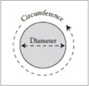
“Let’s recall what we mean by ‘pi’ It’s a ratio of two distances. One of them is the diameter, the distance across the circle through its center. The other is the circumference, the distance around the circle.
“Pi” is defined as their ratio, the circumference divided by the diameter.
The area of a circle is given by this formula: πr² (where r is the radius of the circle)
All of us memorized this formula in high school, but where does it come from? It’s not usually proven in geometry class. If you went on to take calculus, you probably saw a proof of it there, but is it really necessary to use calculus to obtain something so basic? Yes, it is.
What makes the problem difficult is that circles are round. If they were made of straight lines, there’d be no issue. Finding the areas of triangles and squares is easy. But working with curved shapes like circles is hard. The key to thinking mathematically about curved shapes is to pretend they’re made up of lots of little straight pieces. That’s not really true, but it works . . . as long as you take it to the limit and imagine infinitely many pieces, each infinitesimally small. That’s the crucial idea behind all of calculus.
Here’s one way to use it to find the area of a circle. Begin by chopping the area into four equal quarters, and rearrange them like so.
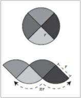
The strange scalloped shape on the bottom has the same area as the circle, though that might seem pretty uninformative since we don’t know its area either. But at least we know two important facts about it. First, the two arcs along its bottom have a combined length equal to half the circumference of the original circle (because the other half of the circumference is accounted for by the two arcs on top). Since the whole circumference is pi times the diameter, half of it is pi times half the diameter or, equivalently, pi times the radius r. That’s why the diagram above shows πr as the combined length of the arcs at the bottom of the scalloped shape. Second, the straight sides of the slices have a length of r, since each of them was originally a radius of the circle.
Next, repeat the process, but this time with eight slices, stacked alternately as before.
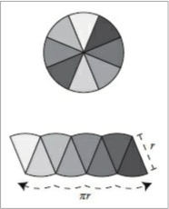
The scalloped shape looks a bit less bizarre now. The arcs on the top and the bottom are still there, but they’re not as pronounced. Another improvement is the left and right sides of the scalloped shape don’t tilt as much as they used to. Despite these changes, the two facts above continue to hold: the arcs on the bottom still have a net length of πr and each side still has a length of r. And of course the scalloped shape still has the same area as before — the area of the circle we’re seeking — since it’s just a rearrangement of the circle’s eight slices.
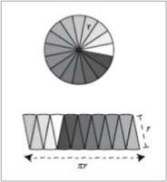
As we take more and more slices, something marvellous happens: the scalloped shape approaches a rectangle. The arcs become flatter and the sides become almost vertical. In the limit of infinitely many slices, the shape is a rectangle. Just as before, the two facts still hold, which means this rectangle has a bottom of width πr and a side of height r. But now the problem is easy. The area of a rectangle equals its width times its height, so multiplying πr times r yields an area of πr² for the rectangle. And since the rearranged shape always has the same area as the circle, that’s the answer for the circle too!”
What a beautiful, simple and visual way to prove something we learned by rote!
Prof. Strogatz’s approach teaches us the following tips:
3. Visual: Humans can process images much, much faster than text, and its also a great way to ensure retention. Just adding a picture to a piece of text can increase retention by more than 6X. In the proof above, I love how visuals are used to make the point clear. In fact Prof. Strogatz uses images even in traditionally non-visual disciplines like algebra (check out his explanation of quadratic equations in the book). You just begin to “see” maths differently!
For your technical information too, ask yourself – how can I visually depict what I’m trying to show?
4. Riddle/mystery/curiosity: One of our most powerful impulses is curiosity. If you just tell me a formula, I’m disinterested… But ask me a provocative question, and I’m all ears. At the beginning Prof. Strogatz asks us “all of you memorised this formula, but do you know how it is derived?”, and immediately our curiosity is piqued. He then adds surprise to the question by setting the norm: ‘It’s easy to get the area of shapes with straight lines. But this shape is different – it’s (jaw drops) round!’ Now I really want to know… How did they figure this out?
So, the next time you have a presentation, in which you talk about having solved an intractable issue, which had mystified you (or the solver) initially, don’t rob the audience of the pleasure of experiencing the mystery as you take them through the solution. Admittedly, this won’t work in all situations, especially with busy corporate leaders (“You want know how we reduced costs by 16%…? Ah, it’s a long and interesting story”) – so use it with caution.
5. Link: While explaining something new, always try and link/relate that with something the audience already knows, so that you aren’t starting cold. We had talked about ‘Starting from the right Point A’ earlier. In this piece, Prof. Strogatz starts from the basic premise that everyone knows – the concept of π as the link between the diameter and circumference of a circle.
This tip is useful when deciding where to start a presentation/article from. Ask yourself: What does the audience already know about this subject?
6. Examples/stories: Frequently when explaining a new concept, we revel in abstraction and jargon (e.g. “extracting gold from soil substrates by harvesting specially selected hyperaccumulating plants” or “calculus is a collection of techniques for manipulating infinitesimals“) – a sure recipe for losing the audience. Prof. Strogatz is always ready with a real world problem and how a particular maths concept is used to solve it. For example, when introducing algebra, he states:
“(Algebra) was developed by Islamic mathematicians around A.D. 800, building on earlier work by Egyptian, Babylonian, Greek, and Indian scholars. One practical impetus at that time was the challenge of calculating inheritances according to Islamic law. For example, suppose a widower dies and leaves his entire estate of 10 dirhams to his daughter and two sons. Islamic law requires that both the sons must receive equal shares. Moreover, each son must receive twice as much as the daughter. How many dirhams will each heir receive? Let’s use the letter x to denote the daughter’s inheritance.”
And that’s how the first algebra problem was formulated! So, ensure that you illustrate your concept with a relevant example or story.
Example III: The world’s raddest blogger
For the final tip, we’ll reference the world’s raddest blogger: Tim Urban. This is the guy who runs the uber-popular waitbutwhy.com – a long-form blog, where he posts articles which are sometimes, wait-for-it, 50,000 words long (take that Twitter)! He also happens to be Elon Musk’s chosen storyteller.
He takes on tough, difficult to understand ideas and uses a mix of the techniques described above, to make it a fun, engaging read. You can check out some of his famous posts on AI, Neuralink, SpaceX et al (though those are like mini-books). Or instead, read this shorter one – on procrastination. It’s one of his most popular posts and gave rise to a TED Talk, which has climbed to Rank 16th on the list of most viewed talks!
Once you read the post, you’ll realise how Tim uses almost every tip we have spoken of here: Visuals (he has some crazy, adorable stick-figure-art going on there), Analogies (the comparison of the brain to a ship being navigated), Surprise (for example, when the Panic Monster is introduced), Riddle/Mystery (“To understand why procrastinators procrastinate so much, let’s start…”), Links (he frequently makes links or connections with actions that we all do at some time) and Examples (“let’s watch YouTube videos of deep sea creatures”).
But there’s one additional tool, which Tim is particularly good at using:
7. Anthropomorphism (A fancy word for ‘humanise’): Want to make a dull, inanimate topic interesting? Literally put some life in it, give it human traits. We do this all the time – with cars (“ah, she’s got a mind of its own”), laptops (“this guy always crashes before a key meeting”) or ideas (“this option seems too aggressive”). Tim’s a master at using anthropomorphism in his posts. Almost all inanimate objects are humanised (or given funny animal behaviour traits), making them much more relatable (there’s that familiarity aspect again). You’d have seen even Tshiamo use it in her talk (gold particles sitting in “hotel rooms” and “watching Netflix all day”). Some of it is for comic effect, but it makes the communication that much more fun. The next time you are explaining a tough technical concept, see if it’s got some human-like traits. You may breathe new life into your idea.
The V SARALe way to make complex info fun
At the beginning of the post, I had mentioned the way to present complex, technical information is V(ery) SARALe (‘Saral’ means simple in Hindi). That just happens to be a handy mnemonic to remember the 7 tips:
Visual
Surprising
Analogies/metaphors
Riddles/mystery
Anthropomorphism
Linkages (with audience knowledge)
Examples/stories
Mnemonics seem like cheap memory tricks – but what the heck, they work!
Best of luck for the next time you are working on presenting complex information. You may have to put in some work, but hopefully your audience finds it V-SARALe and fun!
If you’d like to train your people in these techniques, or apply it for a critical communication event, we would be happy to help.
*****
Featured image credit: Photo by Robert Scoble on Flickr
Circle images from ‘The Joy of X‘ by Steven Strogatz