Charts are supposed to make information clearer to understand. But sometimes the wrong choice of chart, or the wrong depiction of information on a chart can mislead the audience.
A classic mistake is “breaking the Y axis” of a chart – which results in some visual misrepresentation.
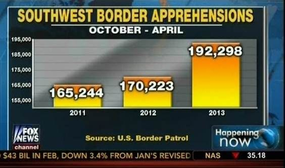
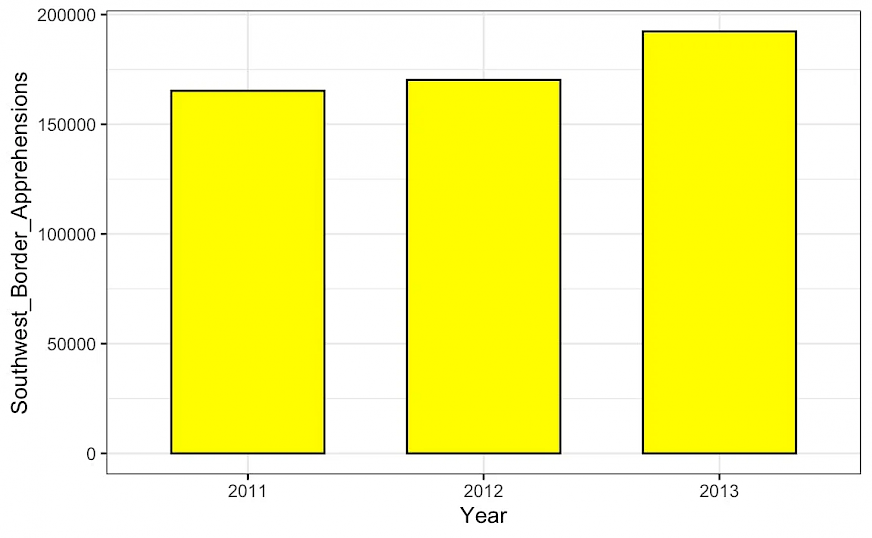
By not starting the Y axis from 0, the scale of the difference is artificially accentuated – the third column “looks” almost 3X of the first one. Instead observe the same chart with the axis starting from 0:
But is it appropriate sometimes to ‘break the axis’? If so when?
Luckily for us, the Economist’s Data Visuals team took on this question and have given us a simple explainer in their weekly newsletter, ‘Off the Charts‘.
(You’ll have to subscribe to the newsletter to access the content – I could not find an online version available. Here’s a PDF I created from the email. All content copyright of The Economist!).
Here are a few key lessons from the piece written by Sarah Leo, visual data journalist at The Economist.
1. Generally, avoid breaking the axis – especially if the data has meaning at lower values too
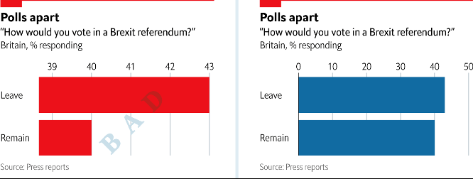
Sarah shares a famous example of the (mis)use of this practice: The example below is loosely based on an infamous chart from the Brexit era. On the left, the axis only starts at 39, overstating the lead of the Leave campaign. Starting the axis at zero, on the right, shows that the Remain campaign was really not that far behind.
2. Also avoid ‘cutting’ the height of a bar/column to ensure the ‘smaller’ bars are seen
In the chart below, the axis is interrupted to better show the difference between all other values. At the same time it conceals the true extent of America’s bar and makes the chart far less useful. If the outlier is the point of the chart, embrace it.
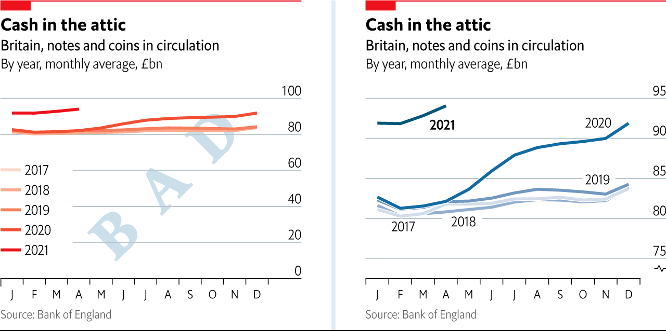
3. It’s ok to break the axis, especially for line charts, if zero is irrelevant.
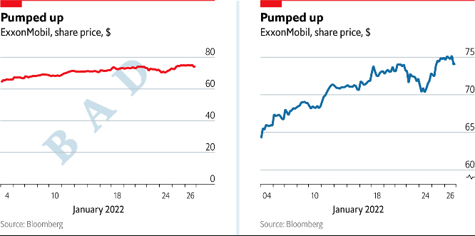
Sarah uses the example below: In the share-price chart below it makes little sense to start the axis at zero. Starting the axis at 60 instead shows that ExxonMobil’s share price hasn’t flatlined. And leaving about a quarter of the chart underneath the lowest data point empty provides a visual cue that the axis does not go to zero. At The Economist, we also add a little symbol at the breaking point to indicate a broken axis.
4. It’s also ok when you are focused on comparison between series rather than the relationship with zero
Broken scales are also useful when the relationship between multiple series is more important than their relationship with zero.
These may seem like minor points, but eventually all add up in how clear your story is for the audience.