Well, apparently we can. Especially their investor presentation for Q3-2015.
(I tried looking for later ones, but couldn’t get my hands on the PDF. Anyway, Q3-15 isn’t too far back, and the learnings are useful.)
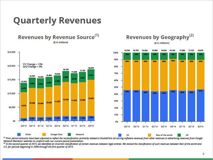
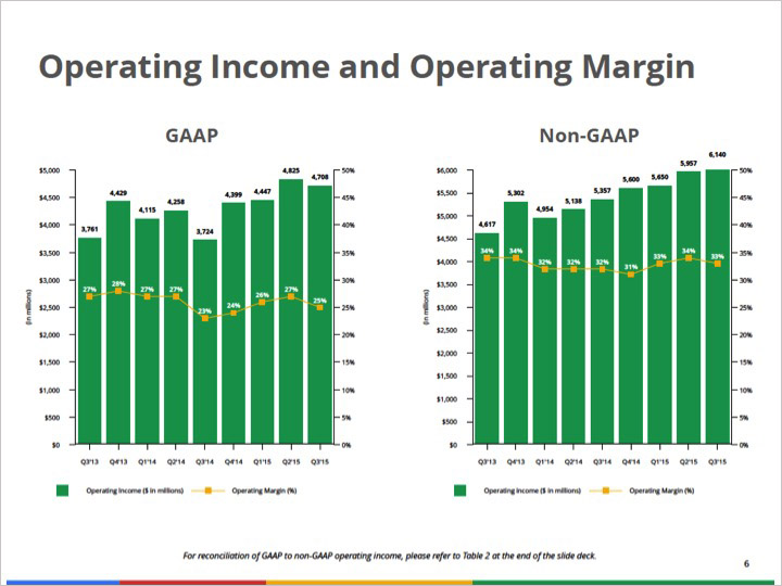
So here are the first two slides from the original presentation.
Pretty underwhelming right? There’s actually some rich irony here, which we’ll come back to later in this post.
Identifying clutter and chart related issues
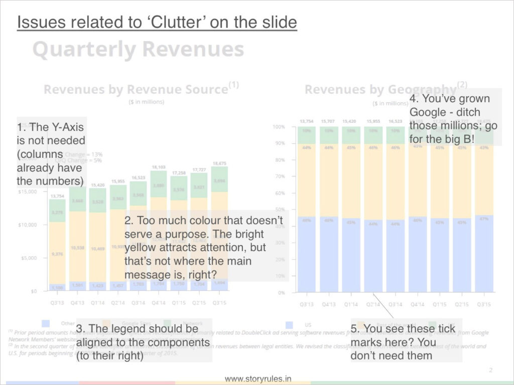
Now then, while there’s a lot to do on this slide, the first thing that catches my eye is the surprising amount of clutter (elements that are either unwanted or hinder comprehension):
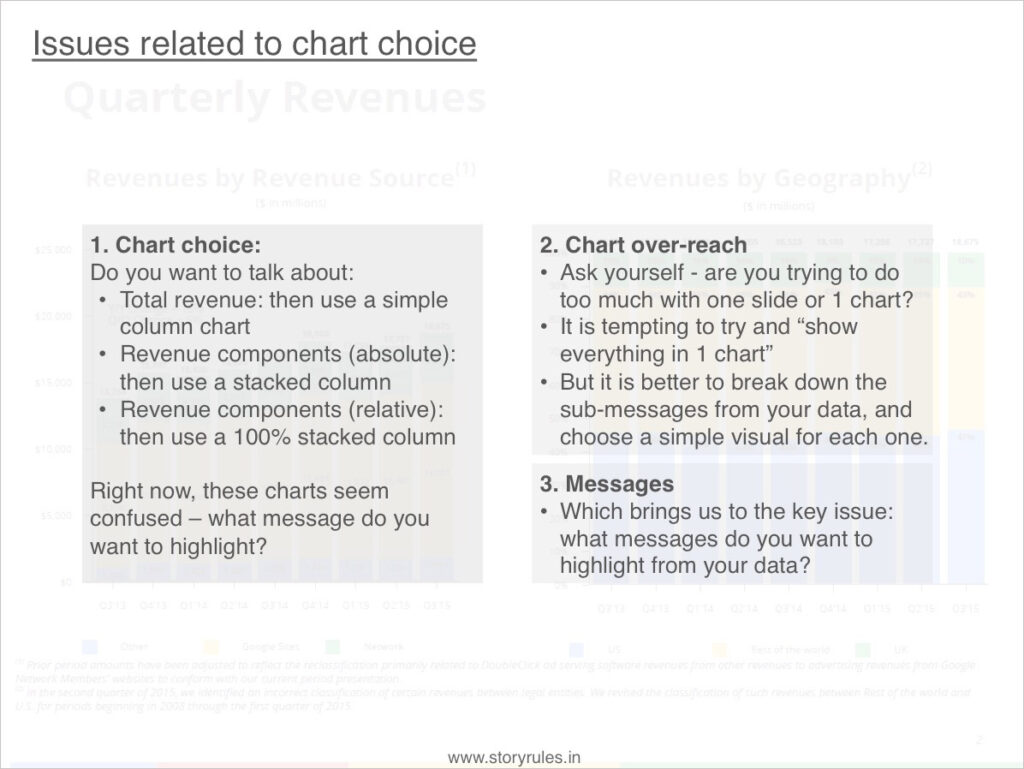
We’ll fix these clutter-related issues in the makeover. But what about the chart itself? Is it the right choice?
So before we figure out how to tell the story, first things first – let’s find the story.
Finding (and telling) the story, slide by slide
In a quarterly financial presentation, while it’s alright to start with the revenue, it would be useful to give a slide or two on the industry scenario/context and any key factors that have influenced performance.
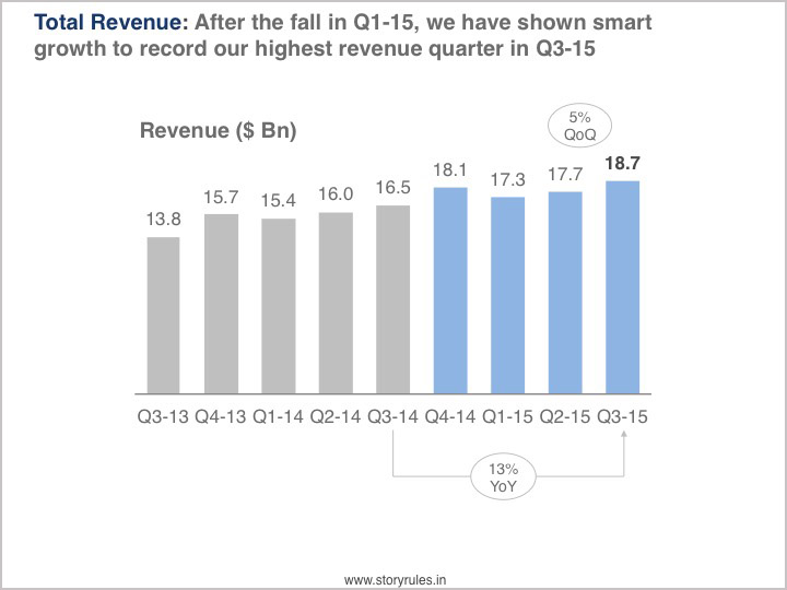
With that done, we start with revenue performance. On this, I would start with the total revenue first, without clouding the slide with details of various breakups (source, geography, product line, division etc.).
The principle: Big picture first, then details.
So, here goes – the first, simple slide in the made-over presentation:
Visual improvements done to the slide/chart:
Message: Clear message highlighted on top, which is supported by the chart
Chart choice: Since it’s just revenue, a simple column chart with suffice
Colour used deliberately: Instead of blindly going with four primary colours (because they happen to be the corporate colours), the key data stands out in blue, while the necessary-but-not-critical data stays in the background in grey
Cleaner: the Y axis, x-axis tick marks are all removed, billions used instead of millions
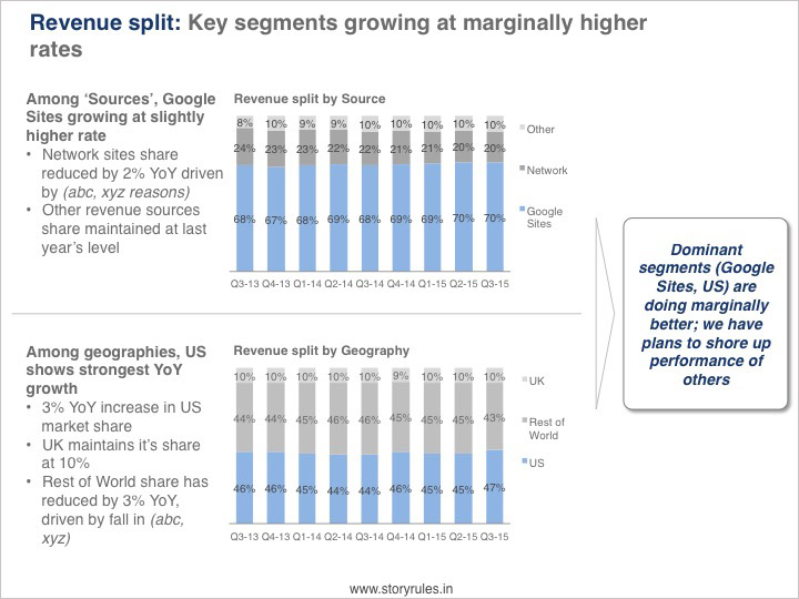
What should be the next slide? Looking at the revenue performance, I bet a lot of questions are popping in the audience’s minds: What drove the increase in the last couple of quarters? How much do key segments contribute and how is that contribution changing?
Now’s a good time to introduce that segment-share chart:
Here, apart from the visual improvements, the changes are:
Explanation for the movement: Why is the share of Network sites reducing? Why is RoW share falling?
A takeaway: that answers the ‘so-what’ question at the end of the slide
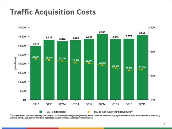
What comes next? Here’s what Google had done in their original presentation – a slide on Traffic Acquisition costs, followed other costs and then the Operating margin.
You’ll notice many of the same issues in these slides as in the revenue one. While we’ll fix them, let’s figure out the narrative first. We’ve spoken about total revenue and its split. Should we dive into an element of cost (TAC) now? Remember the principle – big picture first, then details.
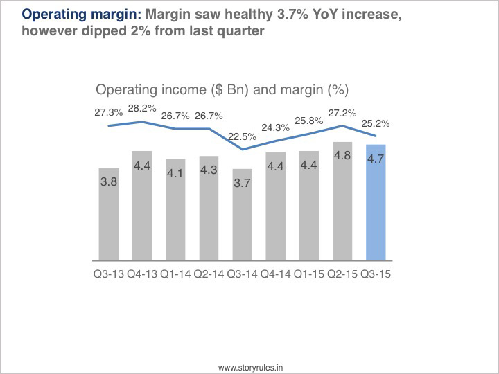
After total revenue, the investors would want to know the total operating income (or EBITDA) and then the breakup of costs that impact the same. So we’ll order our slides accordingly:
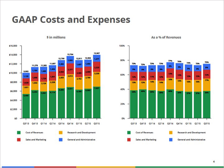
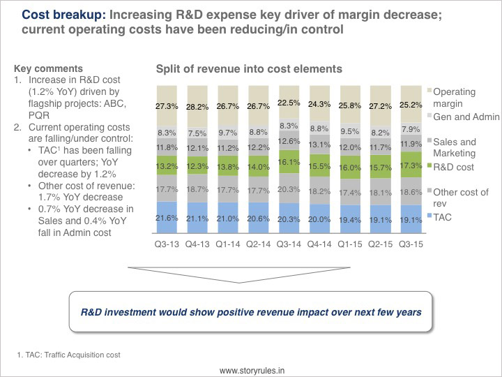
In the above slide, we have used most of the chart-visual principles mentioned earlier. The message focuses on the margin percentage and its movement across the last year and quarter. The fall in the last quarter (and overall across the last 2 years) is something that will need explaining. Now’s the time to show the cost breakup slide.
So, there’s an interesting general trend in the cost data (despite some fluctuation) – current costs are reducing while R&D cost is increasing, accounting for most of the margin erosion since the last two years. We have chosen to focus on YoY change in this presentation; however you may choose to showcase the two-year trend or the QoQ movement. The choice is fine as long as:
It is something the audience would look for, and
It is consistently applied throughout the presentation.
Anyway, that brings us to the end of this makeover. Now let’s tackle that irony bit.
The Irony (and some cheap thrills)
Google’s teams make a lot of presentations and most of them are excellent. In fact, one person who honed her data visualisation and storytelling skills at Google, went on to write a bestselling book, ‘Storytelling with Data’. This is Cole Nussbaumer Knaflic, and I’m sure she’ll have a bunch of suggestions to the Finance team at Google over their investor presentations.
Meanwhile, we can get our cheap thrills by announcing, “Look Ma, I improved a Google presentation”
Featured image: Pixabay ; All slides from Google Investor Presentation Q32015