#SOTD 49: Clear messages on top of charts

#SOTD 49: Clear messages on top of charts
April 21, 2022
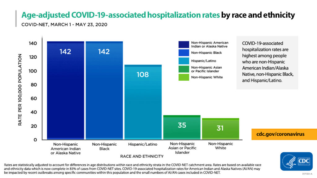
Normally when we create charts, we just put a title on top like this one by the US CDC:

Instead, it could have a message on top of the title. Something like: ‘Covid Hospitalisation rates almost 4-5X for African Americans and Hispanic Americans as compared to White Americans’The issue with this chart is that it makes you actually pore through the chart (with the legend, colours etc) to understand what it wants to say.
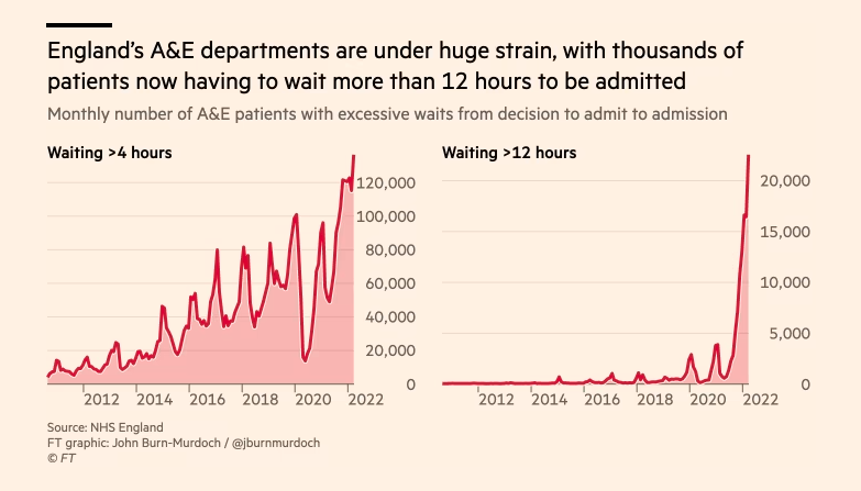
Here is an example of a recent chart with a clear message on top tweeted by Oliver Barnes of the Financial Times:

Also note:Having that clear message above makes it easier and faster for the reader to understand.
- The right choice of chart (line)
- Clear titles and legend
- Light gridlines that fade to the background
#SOTD 49

Related Posts
Insights on India’s Economy from the CEA
April 11, 2026
9 views
Will AI Take Away All Jobs
April 4, 2026
16 views
The Story of the European Rennaissance
March 28, 2026
15 views
How to Write with Humour
March 21, 2026
24 views
Decoding Gen-Alpha Speak
March 14, 2026
27 views
How AI signals a return to oral communication
March 7, 2026
30 views


